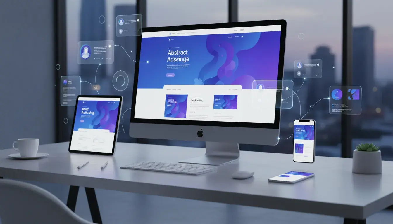
Introduction
Your website is often the first impression potential customers have of your business. In 2026, that first impression needs to be flawless.
The digital landscape has evolved dramatically. User expectations have skyrocketed. What worked three years ago now feels outdated and clunky.
A website redesign isn't just about making things look prettier. It's a strategic investment in your business's future. It's about creating experiences that convert visitors into customers, improving search engine rankings, and staying competitive in an increasingly crowded marketplace.
Think about the last time you visited a slow, confusing website. You probably left within seconds. Your potential customers do the same thing when they land on an outdated site.
This guide walks you through the complete website redesign process for 2026. You'll learn when it's time to redesign, how to set clear goals, and what technical considerations matter most. We'll cover everything from SEO preservation to choosing the right technology stack.
Whether you're a small business owner in Montreal or running an enterprise-level operation, these best practices will help you create a website that drives real business results. You'll discover how to avoid common pitfalls that waste time and money during redesigns.
By the end of this article, you'll have a clear roadmap for transforming your website into a powerful business asset. You'll understand the steps needed to plan, execute, and launch a successful redesign that positions your business for growth.
The best part? You don't need to be a technical expert to understand and implement these strategies. Let's dive in.
When to Know It's Time for a Website Redesign
Most businesses wait too long to redesign their websites. They watch conversion rates drop and bounce rates climb, wondering why their once-effective site no longer performs.
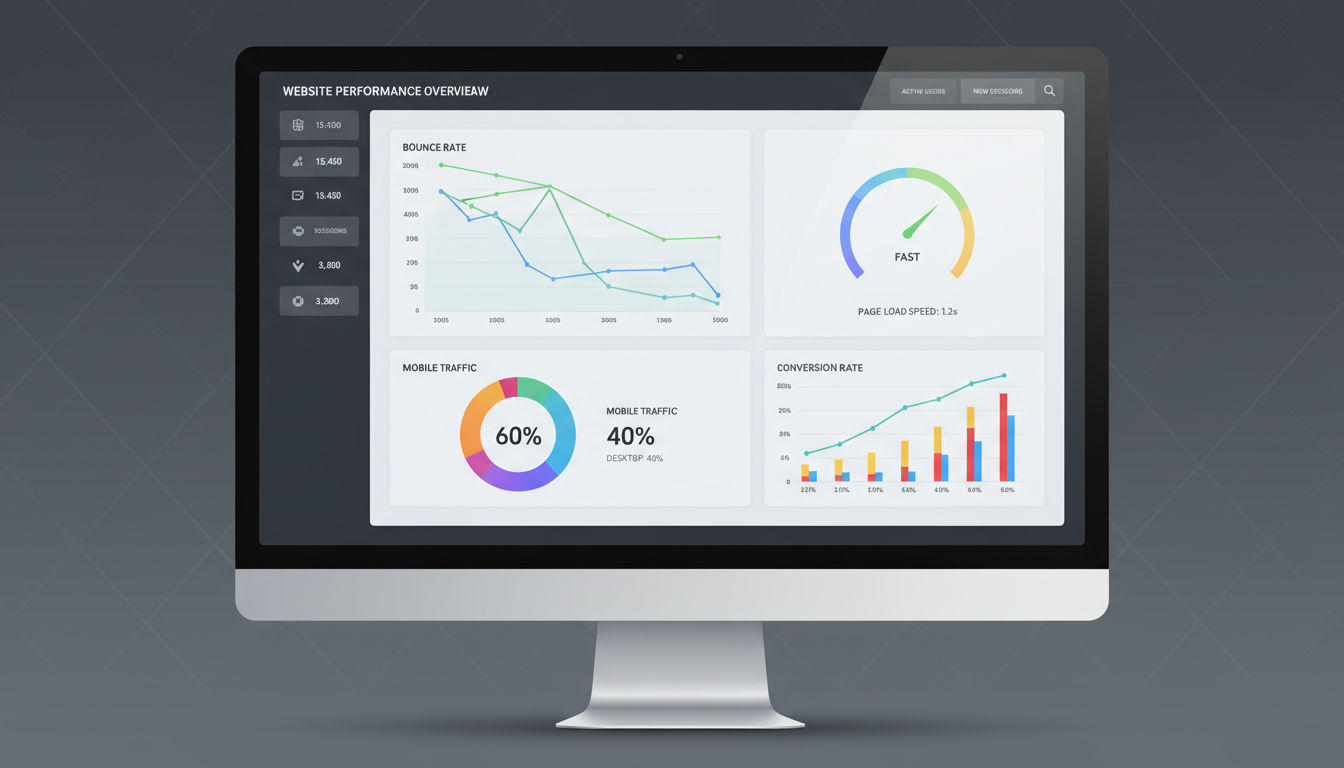
Several clear signs indicate it's time for a refresh. Your bounce rate exceeding 70% is a red flag. If visitors leave immediately after landing on your site, something's fundamentally wrong with the user experience.
Mobile traffic represents over 60% of web traffic in 2026. If your site isn't mobile-optimized, you're losing more than half your potential customers. Check your analytics to see how mobile users interact with your current site.
Page load times matter more than ever. Google's Core Web Vitals have become critical ranking factors. If your site takes longer than three seconds to load, you're hemorrhaging visitors and search rankings simultaneously.
Your conversion rate tells an important story. When form submissions, phone calls, or purchases decline despite steady traffic, your site isn't doing its job. The design, messaging, or user journey needs attention.
Look at your competitors' websites. If they've all modernized while yours looks dated, you're at a disadvantage. Potential customers compare options quickly. An outdated design signals an outdated business.
Analytics reveal crucial patterns. High exit rates on key pages, low time-on-site metrics, and declining organic search traffic all point toward redesign necessity. These numbers don't lie about user experience problems.
Technology changes rapidly. If your site runs on outdated platforms or lacks essential features like chatbots, AI assistance, or personalization, you're falling behind. Modern users expect modern functionality.
Security concerns also drive redesign decisions. Older websites built on outdated frameworks become vulnerable to attacks. Protecting customer data isn't optional in 2026.
Finally, business evolution matters. If your services, products, or brand positioning have changed significantly since your last redesign, your website should reflect that growth. Misalignment between your current offerings and website content confuses potential customers.
Setting Clear Goals and Objectives

Starting a website redesign without clear goals is like driving without a destination. You'll burn resources without knowing if you're headed in the right direction.
Define specific, measurable outcomes before touching a single design element. "Improve the website" isn't a goal—it's a wish. "Increase contact form submissions by 40% within six months" gives you something concrete to work toward.
Common redesign goals include improving conversion rates, reducing bounce rates, increasing average session duration, and boosting organic search traffic. Pick three to five primary objectives that align with your business needs.
Your website goals should connect directly to business objectives. If your company wants to expand into new markets, your redesign should include features that attract and convert those specific audiences. If customer retention matters most, focus on user account features and personalized experiences.
Revenue impact matters to stakeholders. Translate website goals into business terms. Show how a 30% increase in qualified leads could translate to actual revenue growth. This makes budget approval much easier.
Get stakeholder buy-in early. Include decision-makers from marketing, sales, customer service, and IT in goal-setting discussions. Each department has valuable insights about what the website needs to accomplish.
Document everything in a project brief. Write down your goals, success metrics, timeline, and budget constraints. This document becomes your north star when difficult decisions arise during the redesign process.
Set realistic timelines. A complete website redesign typically takes three to six months, depending on complexity. Rushing leads to mistakes. Taking too long means you're spending months with an underperforming site.
Expectation management prevents disappointment. Explain to stakeholders that results won't appear overnight. SEO improvements take time. User behavior changes gradually. Set check-in points at 30, 60, and 90 days post-launch to review progress.
Finally, establish baseline metrics now. Document your current conversion rates, traffic sources, bounce rates, and other key performance indicators. You can't measure improvement without knowing where you started.
Conducting a Comprehensive Website Audit
You can't improve what you don't measure. A thorough website audit reveals exactly what's working and what's broken on your current site.
Start with performance metrics. Use tools like Google PageSpeed Insights, GTmetrix, and Google Search Console to understand your site's technical health. These tools identify speed issues, mobile usability problems, and indexing errors that hurt your rankings.
User experience evaluation comes next. Navigate your site as a first-time visitor would. Try to complete key actions like finding contact information, reading service descriptions, or making a purchase. Note every point of friction or confusion.
Heat mapping tools like Hotjar or Microsoft Clarity show where users actually click, how far they scroll, and where they abandon pages. This data reveals the gap between your intended user journey and reality.
Quick question
Want to turn this into a real plan?
If you want expert help with strategy, design, development, marketing, or automation — we’ll recommend the fastest path forward for your goals.
Content inventory sounds tedious but proves invaluable. Create a spreadsheet listing every page on your site. Note the URL, page title, meta description, word count, and purpose. This inventory helps you decide what to keep, update, or eliminate during the redesign.
SEO analysis identifies your strongest performing content. Which pages rank well in search engines? Which ones drive the most organic traffic? These pages need special attention during migration to preserve their rankings.
Check your backlink profile using tools like Ahrefs or SEMrush. Identify which pages have earned quality backlinks from other websites. Losing these pages during a redesign would damage your SEO authority.
Technical infrastructure assessment examines your hosting environment, content management system, and integrations. Is your current platform scalable? Does it support modern features you'll need? Can it handle traffic spikes without crashing?
Review your site's accessibility. Run tests using WAVE or axe DevTools to identify barriers for users with disabilities. In 2026, accessibility isn't optional—it's a legal requirement and moral obligation.
Analyze your conversion funnel. Where do potential customers enter your site? What path do they take before converting? Where do they drop off? Understanding these patterns helps you design better user journeys.
Document everything you find. Create a comprehensive audit report that serves as a reference throughout the redesign process. This report helps justify design decisions and keeps the project focused on solving real problems.
Understanding Your Target Audience in 2026
Designing for everyone means designing for no one. Successful website redesigns start with deep audience understanding.
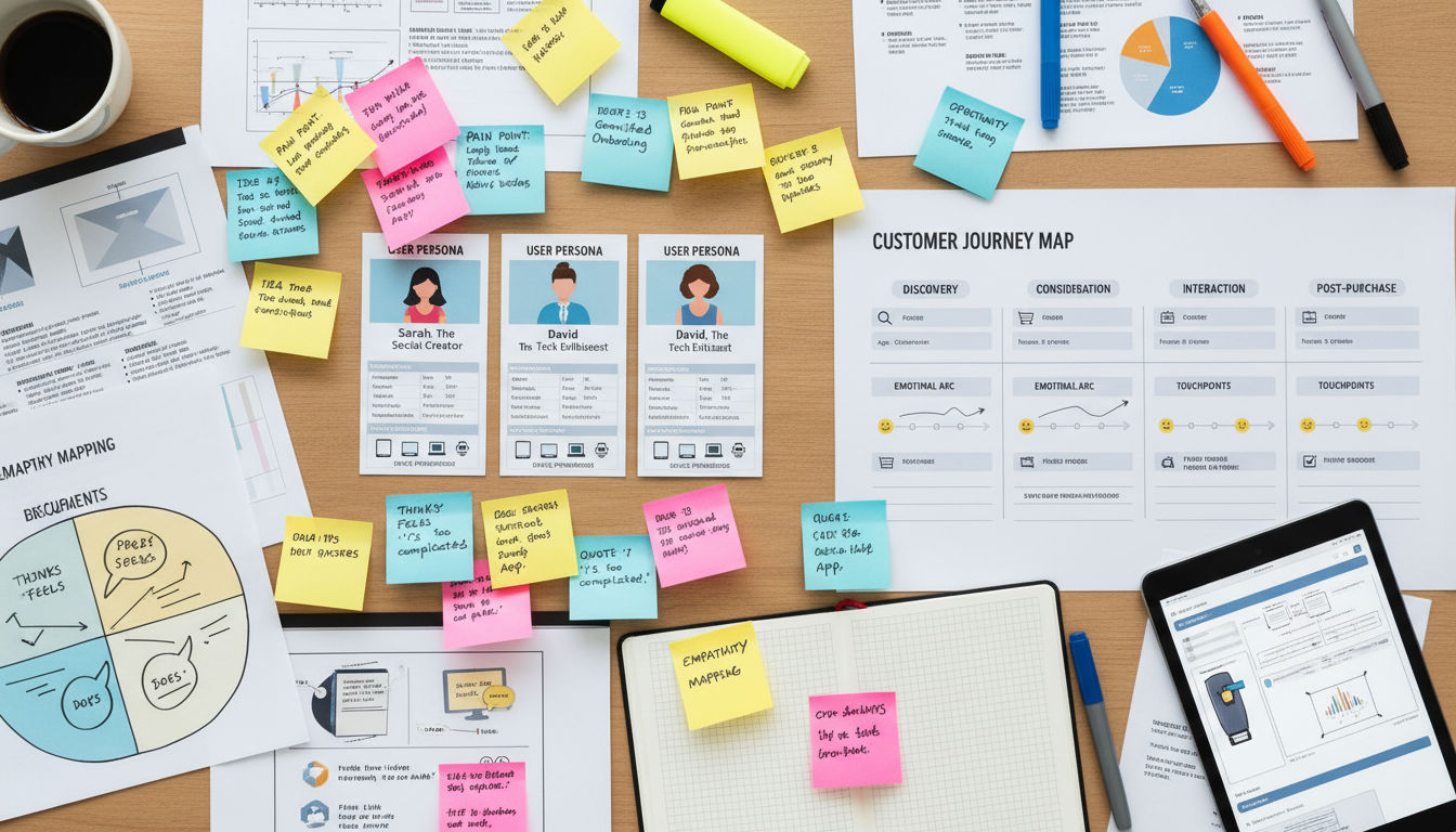
User research goes beyond basic demographics. Yes, knowing your audience's age, location, and income matters. But understanding their pain points, goals, and online behaviors matters more.
Create detailed user personas representing your key audience segments. Give each persona a name, background, and specific challenges your business solves. Include their preferred devices, technical comfort level, and decision-making process.
Behavioral analytics reveal how real users interact with your current site. Google Analytics 4 shows user journeys across devices and sessions. You'll see which content resonates and which pages cause confusion.
Interview actual customers. Ask why they chose your business, what information they needed during the decision process, and what nearly stopped them from converting. These conversations uncover insights that data alone can't provide.
Survey your audience about their website preferences. What features do they value most? What frustrates them about similar websites? Keep surveys short—five to seven questions maximum—to get higher response rates.
User journey mapping visualizes the complete customer experience. Map out every touchpoint from initial awareness through post-purchase support. Identify opportunities to improve the experience at each stage.
Accessibility requirements have expanded significantly by 2026. Your site must work for users with visual, auditory, motor, and cognitive disabilities. This isn't just about compliance—it's about reaching everyone who could benefit from your services.
Follow WCAG 2.2 guidelines at minimum. Ensure sufficient color contrast, provide text alternatives for images, make all functionality keyboard-accessible, and design forms that screen readers can navigate easily.
Consider neurodiversity in your design decisions. Some users struggle with busy layouts, auto-playing videos, or complex navigation. Clean, simple designs benefit everyone, not just users with specific needs.
Mobile behavior differs from desktop behavior. Mobile users often seek quick information—phone numbers, addresses, hours of operation. Desktop users might research in-depth. Your redesign should accommodate both use cases seamlessly.
Privacy concerns have intensified. Users in 2026 expect transparent data practices and easy-to-understand privacy controls. Build trust by being upfront about how you collect and use visitor data.
Web Design Best Practices for Modern Websites
Design trends come and go, but fundamental design principles remain constant. Your 2026 website needs to balance aesthetic appeal with functional excellence.
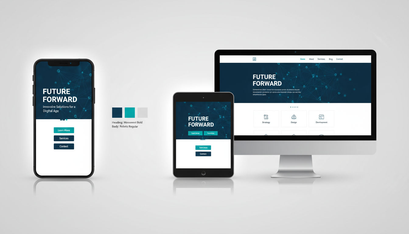
Mobile-first design isn't optional anymore. Start designing for smartphone screens, then scale up to tablets and desktops. This approach ensures your site works beautifully on the devices most people use.
Responsive design means your site adapts fluidly to any screen size. Content reflows naturally. Images scale appropriately. Navigation transforms from horizontal menus to hamburger icons on smaller screens.
Visual hierarchy guides users' attention to what matters most. Use size, color, contrast, and spacing to create clear importance levels. Your most important call-to-action button should be the most visually prominent element on the page.
White space isn't wasted space. It gives content room to breathe and makes information easier to process. Cramming too much into a small area overwhelms visitors and reduces comprehension.
Typography choices affect readability dramatically. Use web-safe fonts that load quickly and display consistently across devices. Maintain sufficient font size—16px minimum for body text. Ensure adequate line spacing for comfortable reading.
Color psychology influences user behavior. Blues and greens convey trust and calm. Reds create urgency. Your color choices should align with your brand personality and desired user emotions.
Contemporary design trends in 2026 include subtle animations, bold typography, asymmetrical layouts, and immersive scrolling experiences. Adopt trends that enhance usability, not just aesthetics.
Page speed directly impacts both user experience and search rankings. Optimize images by compressing them without quality loss. Implement lazy loading so images only load when users scroll to them.
Core Web Vitals measure real user experience. Largest Contentful Paint should occur within 2.5 seconds. First Input Delay should be under 100 milliseconds. Cumulative Layout Shift should stay below 0.1. These metrics are ranking factors Google takes seriously.
Minimize JavaScript and CSS files. Remove unused code. Combine files where possible. Use browser caching so returning visitors load pages faster.
AI-enhanced user experiences have become standard by 2026. Chatbots provide instant customer service. Personalization engines show different content based on user behavior. Predictive search helps users find information faster.
Implement AI thoughtfully. Don't force users to interact with chatbots when they prefer human contact. Always provide easy ways to reach real people. AI should enhance human service, not replace it.
Micro-interactions add delight to user experiences. Button hover effects, loading animations, and form validation messages make interfaces feel responsive and alive. Keep these subtle—they should enhance without distracting.
SEO Considerations During Website Redesign
A poorly executed website redesign can destroy years of SEO progress overnight. Protecting your search rankings requires careful planning and execution.
Document your current SEO performance before changing anything. Record your rankings for target keywords, organic traffic levels, and top-performing pages. This baseline helps you measure post-launch impact.
Preserve your URL structure whenever possible. Changing URLs without proper redirects causes broken links and lost rankings. If you must change URLs, create a comprehensive redirect plan.
301 redirects permanently forward old URLs to new ones. Map every single old URL to its new equivalent. Don't redirect everything to your homepage—that's lazy and damages SEO. Each old page should redirect to the most relevant new page.
Test your redirects before launch. Broken redirects frustrate users and waste the SEO equity you've built. Use tools like Screaming Frog to verify every redirect works correctly.
Maintain your site structure and internal linking architecture. If certain pages currently rank well, keep them in similar positions within your site hierarchy. Don't bury important pages three clicks deep when they were previously one click from the homepage.
Meta titles and descriptions need careful attention. If current pages rank well, keep similar titles and descriptions. Make improvements, but don't completely overhaul what's working.
Preserve your best content. Pages that rank well and drive conversions should transfer to the new site with minimal changes. Improve formatting and readability, but don't rewrite content that's already performing well.
Image optimization matters for SEO. Use descriptive filenames and alt text. Compress images to reduce file sizes. Implement responsive images that serve appropriately sized versions to different devices.
Schema markup helps search engines understand your content. Implement structured data for your business information, services, reviews, and FAQ sections. This can earn you rich snippets in search results.
XML sitemaps tell search engines which pages to index. Generate a new sitemap for your redesigned site. Submit it to Google Search Console immediately after launch.
Monitor search performance closely post-launch. Check Google Search Console daily for the first two weeks. Look for crawl errors, indexing issues, or sudden ranking drops. Quick detection means quick fixes.
Expect some temporary ranking fluctuations. Search engines need time to recrawl and reassess your site. Minor drops in the first few weeks are normal. Significant drops indicate problems that need immediate attention.
Content Strategy and Migration Planning
Great design means nothing without great content. Your content strategy determines whether your redesigned site actually achieves business goals.
Start with a content audit. Review every piece of content on your current site. Categorize each page as keep, update, combine, or delete. This process often reveals you have far more content than you actually need.
Keep content that performs well. Pages with high traffic, strong engagement, or good conversion rates deserve a place on your new site. Improve them if possible, but don't eliminate what works.
Update outdated content rather than deleting it. If a page has good SEO authority but outdated information, refresh it. Update statistics, add recent examples, and improve readability.
Combine thin content. If you have five pages about similar topics, each with 200 words, consider creating one comprehensive 1,000-word page. Search engines prefer thorough, authoritative content over multiple shallow pages.
Delete content that serves no purpose. Outdated blog posts, discontinued products, and duplicate pages clutter your site and confuse users. Removing them improves overall site quality.
Content gaps represent opportunities. What questions do potential customers ask that your current site doesn't answer? Create new content that fills these gaps and attracts more qualified traffic.
Plan your content migration carefully. Create a spreadsheet mapping old URLs to new URLs. Note which content stays the same, which gets updated, and which is newly created. This document guides the migration process and prevents content from getting lost.
Quality over quantity always wins. One excellent 2,000-word guide provides more value than ten shallow 200-word pages. Focus your efforts on creating truly helpful content.
Optimize content for featured snippets. Structure information to directly answer common questions. Use clear headings, concise paragraphs, and bulleted lists. Featured snippets drive significant traffic.
Update your content for current SEO best practices. Include target keywords naturally in headings and body text. Add internal links to related pages. Ensure every page has a unique, compelling meta description.
Consider content formats beyond text. Videos, infographics, downloadable guides, and interactive tools engage users differently. Diverse content types appeal to different learning preferences.
Develop a content calendar for post-launch. Your website is never truly finished. Plan to add fresh content regularly to maintain relevance and improve search rankings over time.
Choosing the Right Technology Stack
Your technology choices determine what your website can do today and how easily it can grow tomorrow. Choose wisely, because switching platforms later is expensive and disruptive.
Content management systems (CMS) range from simple to complex. WordPress powers over 40% of websites for good reason—it's flexible, well-supported, and works for most use cases. Other options like Webflow, Craft CMS, or headless solutions fit specific needs.
Consider your team's technical capabilities. A powerful CMS means nothing if your team can't use it effectively. Choose technology that matches your internal expertise or budget for ongoing professional support.
Headless CMS architectures separate content management from presentation. This approach offers maximum flexibility and performance but requires more technical expertise. It's ideal for complex, multi-platform content strategies.
E-commerce functionality requires specialized platforms. Shopify, WooCommerce, and BigCommerce each have strengths. Evaluate based on your product catalog size, customization needs, and integration requirements.
Scalability planning prevents future headaches. Your site should handle traffic spikes without crashing. Choose hosting and architecture that can grow with your business. Starting small is fine, but ensure you can scale up easily.
Future-proofing means selecting technologies with strong developer communities and regular updates. Avoid proprietary systems that lock you into one vendor. Open-source solutions typically offer more flexibility and longevity.
Integration capabilities matter tremendously. Your website needs to connect with your CRM, email marketing platform, analytics tools, and other business systems. Verify that your chosen technology stack supports necessary integrations.
API availability enables custom integrations. Even if pre-built integrations exist for your current tools, you'll likely need custom connections eventually. Platforms with robust APIs provide more long-term flexibility.
Next step
Ready for a quote and timeline?
Send a quick note with what you’re building, your deadline, and what success looks like — we’ll reply with clear next steps.
Consider total cost of ownership. Free platforms aren't actually free when you factor in hosting, plugins, themes, and development time. Paid platforms might cost more upfront but save money long-term through efficiency.
Security features should be built-in, not afterthoughts. Choose platforms with regular security updates, strong authentication options, and good track records. Your customers' data deserves protection.
Work with experienced developers who understand your chosen platform deeply. At Vohrtech, we help businesses select and implement technology stacks that align with their goals and growth plans.
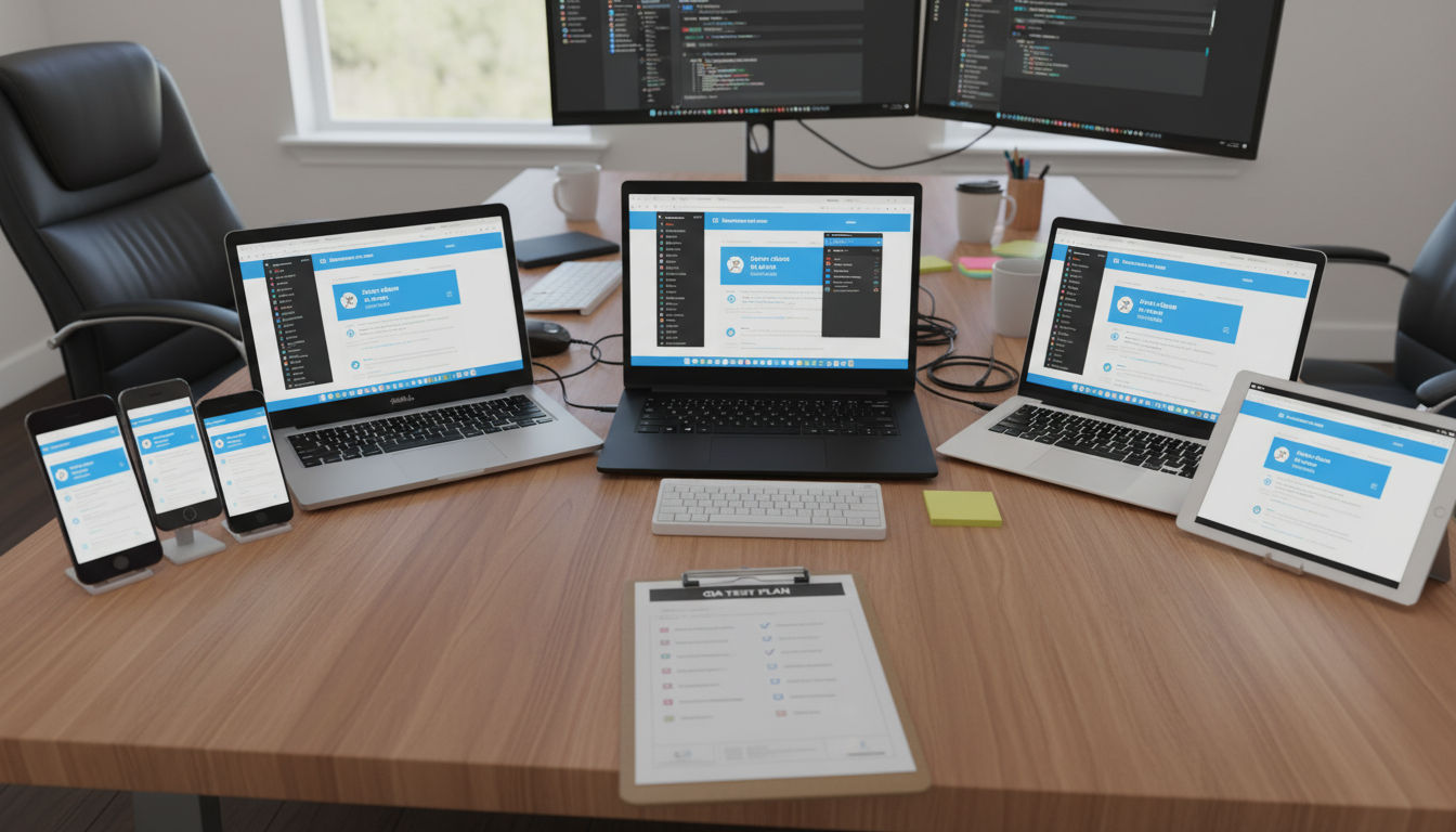
Testing and Quality Assurance
Launching a website without thorough testing is like opening a store without checking if the doors work. Quality assurance catches problems before customers encounter them.
Cross-browser testing ensures your site works everywhere. Test on Chrome, Safari, Firefox, and Edge at minimum. Don't assume what works in one browser works in all of them.
Device testing goes beyond responsive design checks. Actually test on real smartphones, tablets, and desktop computers. Emulators help, but nothing replaces testing on actual devices.
Different screen sizes reveal different issues. Test on small phones, large phones, tablets in both orientations, laptops, and large desktop monitors. Your site should look intentional at every size.
Functionality testing verifies every feature works correctly. Submit every form. Click every button. Test your search function. Try to break things. If you can't break it, users probably can't either.
User acceptance testing (UAT) involves real users attempting real tasks. Watch them navigate your site without guidance. Note where they hesitate, get confused, or fail to complete objectives. These observations reveal usability issues you've become blind to.
Performance testing measures load times under various conditions. Test with slow internet connections. Test with many simultaneous users. Identify bottlenecks before they affect real customers.
Run Lighthouse audits in Chrome DevTools. These audits assess performance, accessibility, SEO, and best practices. Address issues flagged in these reports before launch.
Accessibility testing ensures everyone can use your site. Use automated tools like WAVE, but also test with actual screen readers. Navigate using only a keyboard. Verify that all functionality remains accessible.
Security testing identifies vulnerabilities. Run security scans to check for common issues. Ensure your SSL certificate is properly installed. Verify that forms protect against spam and injection attacks.
Content review catches typos, broken links, and formatting inconsistencies. Read every page. Click every link. View every image. Fresh eyes catch mistakes you've overlooked dozens of times.
Create a testing checklist documenting every test you'll perform. Assign responsibility for each testing category. Track issues in a spreadsheet or project management tool. Retest after fixes to confirm problems are resolved.
Don't rush testing to meet arbitrary deadlines. Launching a broken site damages your reputation more than launching a week late. Quality always trumps speed.
Launch Strategy and Post-Launch Optimization
Launch day represents a beginning, not an ending. How you launch and what you do afterward determines your redesign's ultimate success.
Phased rollouts reduce risk. Instead of switching everything at once, launch to a small percentage of traffic first. Monitor performance and fix issues before exposing your entire audience to potential problems.
Beta testing with select users provides valuable feedback. Invite loyal customers or email subscribers to preview your new site. Their insights help you refine the experience before the public launch.
Full launches work for smaller sites or when you've tested extensively. If you're confident everything works correctly, switching all traffic to the new site simultaneously is perfectly fine.
Communicate the change to your audience. Send an email announcing your new website. Explain improvements they'll notice. Set expectations about any temporary issues or changed features.
Monitor analytics obsessively during the first week. Watch traffic patterns, bounce rates, conversion rates, and user behavior. Compare metrics to your pre-launch baseline. Significant deviations warrant investigation.
Google Search Console reveals indexing and crawl issues quickly. Check it daily for the first two weeks post-launch. Address any errors immediately to prevent SEO damage.
Set up alerts for critical issues. Configure notifications for site downtime, sudden traffic drops, or error spikes. Quick awareness enables quick responses.
Gather user feedback actively. Add a simple feedback form to your new site. Ask users what they like and what could be better. Real user input guides your optimization priorities.
Expect some negative feedback. Not everyone likes change. Distinguish between legitimate usability issues and simple resistance to something new. Address real problems while giving users time to adjust to cosmetic changes.
A/B testing helps optimize conversion rates post-launch. Test different call-to-action button colors, headline variations, or form layouts. Data-driven decisions beat opinions every time.
Continuous improvement never stops. Schedule regular reviews of your site's performance. Plan quarterly updates addressing user feedback and analytics insights. Your website should evolve alongside your business and audience needs.
Document lessons learned. What went well during the redesign? What would you do differently next time? These insights make future projects smoother and more successful.
Celebrate your success with your team. Launching a website redesign requires tremendous effort from many people. Acknowledge that work and the improved results it delivers.
If you need expert guidance throughout your website redesign journey, explore our services or view our previous projects to see how we've helped businesses transform their digital presence.
Conclusion
Website redesign best practices for 2026 center on user experience, performance, and strategic planning. Success requires understanding when redesign is necessary, setting clear goals, and executing with attention to both design and technical details.
Remember that your website serves your business objectives and your users' needs. Balance aesthetic appeal with functionality. Preserve SEO equity while embracing modern design standards.
The redesign process demands patience and thoroughness. Rushing creates problems that undermine your investment. Following these best practices positions your website as a powerful business asset that drives growth.
Ready to start your website redesign? Contact us to discuss how we can help you create a website that achieves your business goals.