
Introduction
Your website's loading speed isn't just a technical detail. It's a critical factor that directly impacts your bottom line. Studies show that 53% of mobile users abandon sites that take longer than three seconds to load. That's more than half of your potential customers gone before they even see what you offer.
Site speed optimization is the process of improving how quickly your web pages load and become interactive. When visitors land on your site, every second counts. A one-second delay in page response can result in a 7% reduction in conversions. For an e-commerce site making $100,000 per day, that's $2.5 million in lost sales annually.
This guide covers everything you need to know about website speed optimization. We'll walk through measuring your current performance, implementing proven optimization techniques, and maintaining fast load times long-term. You'll learn practical strategies for image optimization, code improvements, caching, server configuration, and mobile performance.
Whether you're running an online store, a service-based business, or a content site, faster page load speeds mean better user experience, higher search rankings, and increased revenue. Many business owners in Montreal and beyond have seen dramatic improvements in their conversion rates simply by addressing site speed issues.
By the end of this guide, you'll understand exactly what's slowing down your site and how to fix it. Let's get started with the fundamentals of performance optimization.
Understanding Site Speed Optimization
Site speed optimization refers to the systematic process of reducing the time it takes for your web pages to load and become fully functional. Think of it like streamlining a factory assembly line. Every unnecessary step removed means faster production and happier customers.
When someone visits your website, their browser requests files from your server. These files include HTML, CSS, JavaScript, images, and other resources. Site speed optimization minimizes the size of these files, reduces the number of requests, and ensures efficient delivery to the user's browser.
Key Performance Metrics Explained
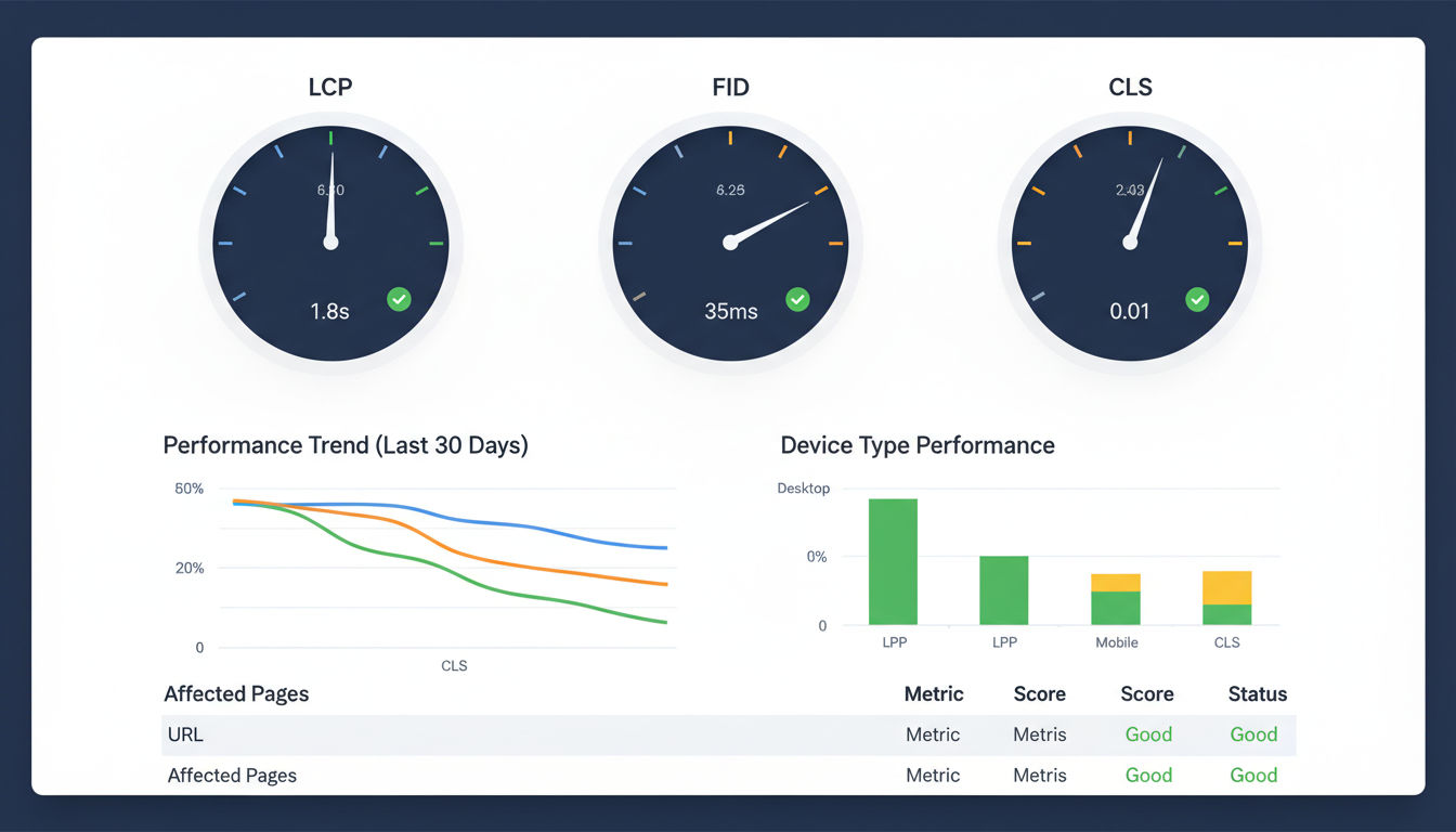
Understanding performance metrics helps you identify problems and measure improvements. Core Web Vitals are Google's official metrics for measuring user experience. These three metrics matter most for both SEO and user satisfaction.
Largest Contentful Paint (LCP) measures loading performance. It tracks how long it takes for the largest visible element to appear on screen. This might be a hero image, video, or text block. Good LCP scores fall under 2.5 seconds.
First Input Delay (FID) measures interactivity. It captures the time between when a user first interacts with your page and when the browser responds. Clicking a button or link should feel instant. Aim for less than 100 milliseconds.
Cumulative Layout Shift (CLS) measures visual stability. Ever tried clicking a button only to have it move at the last second? That's layout shift. Good sites maintain a CLS score below 0.1.
Other important metrics include Time to First Byte (TTFB), which measures server response time, and Total Blocking Time (TBT), which tracks how long your page remains unresponsive during loading.
How Speed Impacts User Experience and Conversions
Page load speed directly affects how people perceive and interact with your business. Fast websites feel professional, trustworthy, and modern. Slow sites create frustration and doubt.
Research from Google shows that as page load time increases from one to three seconds, bounce rate probability increases by 32%. When load time reaches five seconds, bounce rate jumps by 90%. These aren't small numbers. They represent real customers leaving before experiencing your products or services.
Conversion rates follow a similar pattern. Amazon found that every 100ms of latency cost them 1% in sales. Walmart discovered that for every one second improvement in page load time, conversions increased by 2%.
Search engines also use speed as a ranking factor. Google's algorithm considers page experience signals when determining search positions. Faster sites generally rank higher than slower competitors, all else being equal. This means site speed optimization isn't just about user experience. It's about visibility and organic traffic growth.
Measuring Your Current Page Load Speed
You can't improve what you don't measure. Before implementing any optimization strategies, you need a clear picture of your current performance. This baseline helps you track progress and identify the biggest opportunities for speed improvement.
Essential Speed Testing Tools
Several free tools provide comprehensive performance analysis. Each offers unique insights, so using multiple tools gives you the complete picture.
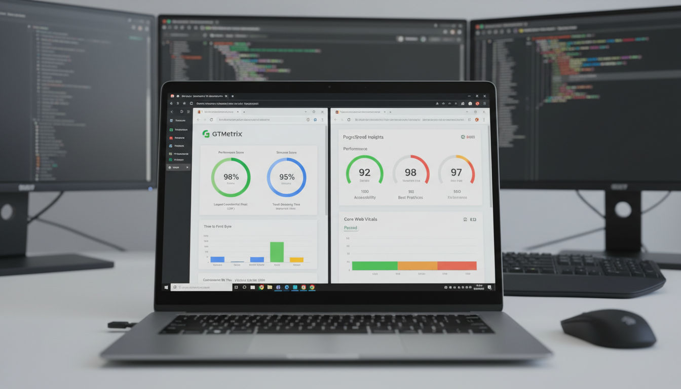
Google PageSpeed Insights is the industry standard. It analyzes both mobile and desktop performance using real-world Chrome user data. The tool provides a performance score from 0 to 100 and specific recommendations for improvement. Scores above 90 are considered excellent, 50-90 need improvement, and below 50 require immediate attention.
GTmetrix combines Google Lighthouse data with additional waterfall charts showing exactly how your page loads. You can test from different geographic locations and see detailed timing for every resource. The waterfall view helps identify which files are slowing down your site.
WebPageTest offers the most detailed analysis available. It provides video recordings of your page loading, filmstrip views, and advanced metrics. You can test from dozens of locations worldwide using real browsers and connection speeds.
Chrome DevTools built into Google Chrome provides real-time performance monitoring. The Network tab shows all resource requests, while the Performance tab records detailed loading timelines. This tool is essential for testing changes before deploying them live.
Understanding Your Performance Optimization Baseline
Testing your site once isn't enough. Performance varies based on time of day, server load, and network conditions. Run tests multiple times and average the results for accuracy.
Test both your homepage and key landing pages. Your homepage might load quickly while product pages or blog posts lag behind. Each page type often requires different optimization approaches.
Document your Core Web Vitals scores, overall page size, number of requests, and fully loaded time. These numbers become your baseline. Many businesses discover their sites load in 8-12 seconds on mobile connections. That's far too slow for modern users.
Geographic location matters too. If you serve customers in Montreal but your server is in California, users experience additional latency. Test from locations where your actual customers browse to get realistic data.
Identifying Critical Speed Bottlenecks
Speed testing tools highlight specific problems holding back your performance. Common bottlenecks include oversized images, render-blocking JavaScript, excessive third-party scripts, and slow server response times.
Look for patterns in your test results. If every tool flags unoptimized images, that's your first priority. If JavaScript execution time is high, focus on code optimization. The recommendations section in each tool provides actionable guidance.
Pay special attention to the critical rendering path. This is the sequence of steps browsers take to render your page. Resources blocking this path delay everything else. Identifying and addressing these blockers often yields the biggest improvements.
Third-party scripts from analytics, advertising, or social media widgets frequently cause problems. Each external script adds requests and processing time. Audit these carefully and remove anything non-essential.
At Vohrtech, we often find that clients are surprised by what's actually slowing their sites. The testing phase reveals hidden issues that weren't obvious from casual browsing. This data-driven approach ensures optimization efforts focus on changes that deliver real results.
Image Optimization for Faster Loading
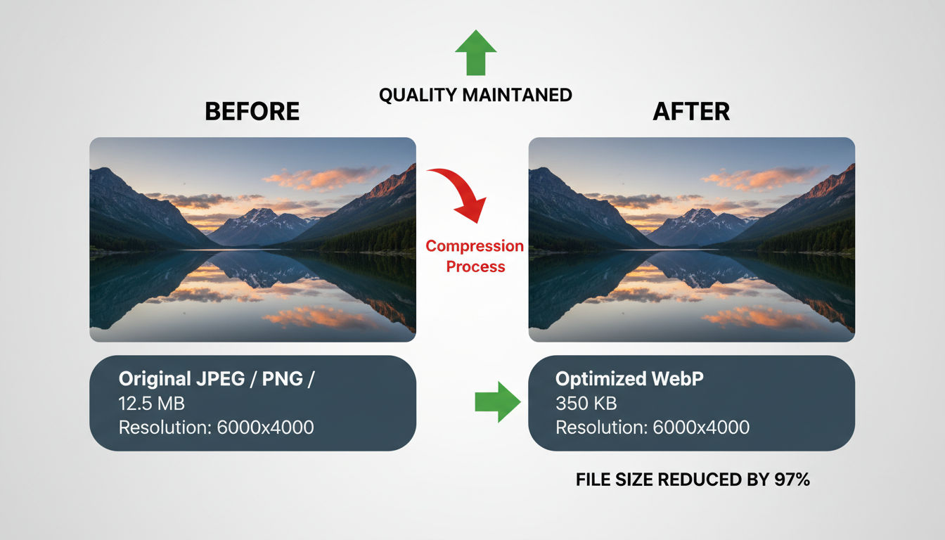
Images typically account for 50-70% of total page weight. A single unoptimized photo can weigh more than your entire HTML, CSS, and JavaScript combined. This makes image optimization one of the highest-impact speed improvements you can implement.
Compression Techniques and Best Practices
Image compression reduces file size without noticeably affecting visual quality. Two types exist: lossy and lossless compression.
Lossy compression removes some image data to achieve smaller file sizes. JPEG uses lossy compression. The key is finding the sweet spot where file size drops significantly but quality remains acceptable. Most images look identical at 80-85% quality compared to 100%, but file sizes shrink by 50% or more.
Lossless compression reduces file size without losing any image data. PNG files often benefit from lossless optimization. Tools remove unnecessary metadata and optimize how color information is stored.
Quick question
Want to turn this into a real plan?
If you want expert help with strategy, design, development, marketing, or automation — we’ll recommend the fastest path forward for your goals.
Before uploading images to your site, resize them to the exact dimensions needed. Never use a 3000x2000 pixel image if your design only displays it at 800x600. The browser still downloads the full file, wasting bandwidth and time.
Use image editing software or online tools to compress files before upload. TinyPNG, ImageOptim, and Squoosh are excellent free options. Many content management systems also offer automatic compression plugins.
Set a standard workflow for your team. Every image should be compressed and properly sized before going live. This prevents the gradual slowdown that happens when sites accumulate dozens of unoptimized images over time.
Modern Image Formats (WebP, AVIF)
Newer image formats deliver better compression than traditional JPEG and PNG files. WebP, developed by Google, reduces file sizes by 25-35% compared to JPEG while maintaining similar quality. It supports both lossy and lossless compression plus transparency and animation.
AVIF is even newer and more efficient. It can achieve 50% smaller file sizes than JPEG with comparable quality. However, browser support is still growing. Always provide fallback formats for older browsers.
Implementing modern formats requires serving different versions based on browser capabilities. Your server detects what the user's browser supports and delivers the optimal format. Most modern hosting platforms and CDNs handle this automatically.
The performance gains are substantial. A page with ten 200KB JPEG images totals 2MB. Converting those to WebP might reduce total size to 1.3MB. That's 700KB saved, translating to faster loads, especially on mobile connections.
Lazy Loading Implementation
Lazy loading defers image downloads until they're needed. Images below the fold don't load until users scroll near them. This dramatically reduces initial page weight and speeds up the critical rendering path.
Modern browsers support native lazy loading through a simple HTML attribute. Adding loading="lazy" to your image tags enables this feature without JavaScript. It's the easiest performance win available.
<img src="image.jpg" loading="lazy" alt="Description">
For images in the viewport (above the fold), use loading="eager" or omit the attribute entirely. You want these to load immediately. Only defer images users might never see.
JavaScript-based lazy loading solutions offer more control and work in older browsers. Libraries like lazysizes or vanilla-lazyload provide additional features like placeholder images and loading animations.
Responsive Image Strategies
Different devices need different image sizes. A desktop monitor displaying a 1920-pixel-wide image doesn't need the same file as a mobile phone with a 375-pixel screen. Responsive images serve appropriately sized files to each device.
The srcset attribute lets you specify multiple image versions. Browsers automatically choose the best option based on screen size and resolution.
<img src="small.jpg"
     srcset="small.jpg 400w, medium.jpg 800w, large.jpg 1200w"
     sizes="(max-width: 600px) 400px, (max-width: 1200px) 800px, 1200px"
     alt="Description">
This approach can cut mobile image payload by 60-80%. A desktop user might download a 300KB image while a mobile user gets a 50KB version of the same photo. Both see appropriate quality for their device.
Art direction sometimes requires different crops or compositions for different screen sizes. The <picture> element handles these scenarios, letting you serve completely different images based on viewport width.
Many businesses struggle with image optimization because it seems technical and time-consuming. The reality is that proper setup takes a few hours but delivers ongoing benefits. Every new page automatically benefits from the system you've built.
Code Optimization Strategies

Your website's code determines how quickly browsers can process and display content. Bloated, inefficient code slows everything down. Clean, optimized code runs faster and provides better user experiences.
Minifying CSS, JavaScript, and HTML
Minification removes unnecessary characters from code without changing functionality. Spaces, line breaks, comments, and long variable names make code readable for developers but add unnecessary bytes for browsers.
A CSS file with proper formatting and comments might be 50KB. The minified version could be 35KB. That's 30% smaller with identical functionality. Multiply this across all your code files and savings add up quickly.
HTML minification removes whitespace, comments, and optional tags. JavaScript minification goes further, shortening variable names and removing dead code. The result is files that download and parse faster.
Many tools automate minification. Build tools like Webpack, Gulp, or Parcel minify code during deployment. If you use WordPress, plugins like Autoptimize or WP Rocket handle this automatically. Never manually minify files. Use tools that preserve originals for editing and generate minified versions for production.
Test after minification to ensure nothing breaks. Aggressive minification occasionally causes issues with poorly written code. Most modern tools are safe, but verification prevents surprises.
Removing Render-Blocking Resources
Render-blocking resources prevent browsers from displaying content until specific files finish downloading and processing. CSS and JavaScript in your page's <head> section typically block rendering.
When a browser encounters a stylesheet link, it stops rendering until the CSS downloads and parses. This ensures proper styling but delays visible content. The solution is strategic loading of critical CSS inline and deferring non-critical styles.
Critical CSS includes only the styles needed for above-the-fold content. Extract these rules and place them directly in your HTML <head> using <style> tags. This lets the browser render visible content immediately. Load remaining styles asynchronously after initial render.
JavaScript blocks parsing when placed in the <head>. Moving scripts to the bottom of your HTML (before the closing </body> tag) allows content to load first. Alternatively, use the async or defer attributes on script tags.
The async attribute downloads scripts in parallel without blocking parsing. Scripts execute as soon as they download, which might be before page parsing completes. Use this for independent scripts that don't rely on DOM elements.
The defer attribute also downloads in parallel but waits to execute until parsing finishes. This is safer for scripts that manipulate page content. Most scripts should use defer rather than async.
Optimizing Critical Rendering Path
The critical rendering path is the sequence of steps browsers take to convert HTML, CSS, and JavaScript into pixels on screen. Optimizing this path reduces time to first render and improves perceived performance.
First, minimize critical resources. Audit every file loaded in your <head> section. Does it need to be there? Can it load later? Each resource adds latency to the critical path.
Second, reduce the size of critical resources through minification and compression. Smaller files transfer faster, reducing overall render time.
Third, prioritize content order in your HTML. Place important content early in your markup. Browsers render progressively, so content appearing first in HTML displays first to users.
Use resource hints to help browsers prepare for future requests. The preconnect hint establishes early connections to required domains. The prefetch hint downloads resources likely needed on the next page. These hints reduce latency when resources are actually requested.
<link rel="preconnect" href="https://fonts.googleapis.com">
<link rel="prefetch" href="/next-page.html">
Code Splitting Techniques
Code splitting divides JavaScript bundles into smaller chunks loaded on demand. Instead of downloading your entire application code upfront, users get only what they need for the current page.
Modern JavaScript frameworks like React, Vue, and Angular support dynamic imports. These load code modules only when needed, reducing initial bundle size significantly.
A typical single-page application might have a 500KB JavaScript bundle. Code splitting could reduce the initial load to 150KB, with additional chunks loading as users navigate. First page load becomes much faster while maintaining full functionality.
Route-based splitting is the simplest approach. Each page or route gets its own JavaScript chunk. Users visiting your homepage don't download code for your checkout process until they actually shop.
Component-based splitting takes this further. Large, complex components load independently. A modal dialog's code doesn't load until users open it. An image gallery's code waits until users click to view photos.
The development work we do often includes code optimization as a foundational element. Clean, efficient code isn't just about speed. It's easier to maintain, less prone to bugs, and provides better user experiences across the board.
Leveraging Browser Caching and CDNs
Caching stores copies of your site's files so they don't need to be downloaded repeatedly. Proper caching configuration dramatically reduces load times for returning visitors and decreases server load.
Browser Caching Configuration
Browser caching tells visitors' browsers to store certain files locally. When users return to your site, their browser uses cached versions instead of downloading everything again. This makes subsequent page loads nearly instant.
HTTP headers control caching behavior. The Cache-Control header specifies how long browsers should store files. Static resources like images, CSS, and JavaScript rarely change, so they can be cached for long periods.
Set different expiration times for different file types. Images and fonts might cache for one year. CSS and JavaScript could cache for one month. HTML typically has short cache times or no caching since it changes more frequently.
Cache-Control: max-age=31536000, immutable
This header tells browsers to cache the file for one year and never revalidate it. The immutable directive indicates the file will never change at this URL.
When you update cached files, browsers won't automatically get the new version. Solve this with cache busting. Add version numbers or unique hashes to filenames. When files change, their names change, forcing browsers to download the new version.
Your web server or hosting platform handles cache headers. Apache uses .htaccess files. Nginx uses configuration files. Most hosting control panels offer caching settings. WordPress plugins can configure caching without touching server files.
Content Delivery Network Benefits
Content Delivery Networks (CDNs) are distributed server networks that store copies of your site's static files. When someone visits your site, the CDN serves files from the server closest to their location. This reduces latency and speeds up delivery.
If your server is in Montreal and a user browses from Vancouver, their requests travel thousands of kilometers. Each round trip adds latency. A CDN with a Vancouver server delivers files locally, cutting latency by 80% or more.
CDNs also reduce load on your origin server. Static file requests go to the CDN instead. Your server only handles dynamic content and initial HTML. This improves reliability and allows your server to handle more visitors.
Popular CDNs include Cloudflare, Amazon CloudFront, and Fastly. Many offer free tiers suitable for small to medium sites. Setup typically involves changing DNS settings to route traffic through the CDN.
Beyond speed, CDNs provide security benefits. Many include DDoS protection, SSL certificates, and firewall features. They also improve uptime since your site remains accessible even if your origin server experiences issues.
Cache Optimization Best Practices
Effective caching requires strategic planning. Not everything should be cached the same way. Balance performance gains against the need for fresh content.
Static assets (images, fonts, CSS, JavaScript) should have long cache times. These files rarely change and benefit most from caching. Set expiration dates of 6-12 months.
HTML pages need shorter cache times or conditional caching. Content changes require visitors to see updates quickly. Consider caching HTML for a few minutes to an hour, or use ETags for conditional requests.
Third-party resources should load through your CDN when possible. Instead of loading jQuery from a public CDN, serve it through your own CDN. This reduces DNS lookups and gives you control over cache headers.
Monitor cache hit rates to ensure your configuration works effectively. CDN dashboards show what percentage of requests are served from cache versus your origin server. Aim for 80-90% cache hit rates for static resources.
Clear caches strategically when deploying updates. Most CDNs offer purge functions to remove specific files or entire cache layers. Automate cache clearing as part of your deployment process.
Businesses often overlook caching because it seems complex. The truth is that basic caching configuration takes minimal time and delivers immediate results. Every returning visitor benefits from faster load times without any additional work from you.
Server-Side Performance Optimization
Your server is the foundation of your website's performance. Even perfectly optimized code loads slowly on inadequate hosting. Server-side optimization ensures fast response times and reliable service.
Choosing the Right Hosting Solution
Hosting choice significantly impacts site speed. Shared hosting is affordable but shares server resources with dozens or hundreds of other sites. If a neighbor site experiences traffic spikes, your site slows down too.
Virtual Private Servers (VPS) provide dedicated resources at moderate cost. You get guaranteed CPU, RAM, and storage that other sites can't affect. Performance is more consistent and predictable.
Dedicated servers offer maximum performance. The entire physical server runs only your site. This is ideal for high-traffic sites or applications with demanding resource requirements.
Managed WordPress hosting from providers like WP Engine or Kinsta optimizes specifically for WordPress sites. These platforms include built-in caching, CDNs, and security features. Performance is excellent but costs more than basic hosting.
Cloud hosting from AWS, Google Cloud, or DigitalOcean scales resources automatically. Traffic spikes don't slow your site because additional capacity activates on demand. This flexibility comes with complexity requiring technical expertise.
Location matters too. Choose servers close to your primary audience. Montreal-based businesses serving local customers benefit from Canadian data centers. Global audiences need CDNs to serve everyone quickly.
Server Response Time Improvement
Time to First Byte (TTFB) measures how long servers take to start sending data after receiving requests. Fast servers respond in under 200ms. Slow servers might take 1-2 seconds, delaying everything else.
Several factors affect server response time. Database queries are common culprits. Every page load might trigger dozens of database requests. Optimize queries, add indexes to database tables, and implement query caching.
Server-side caching stores generated HTML pages. Instead of rebuilding pages for every request, servers serve cached versions. This reduces database queries and processing time dramatically. First-time visitors still experience full processing, but cached pages load almost instantly.
PHP version matters for WordPress and similar platforms. PHP 8.0+ runs significantly faster than PHP 7.4 or earlier versions. Upgrading PHP is often the single biggest server-side performance improvement available.
Reduce external API calls during page generation. Each external request adds latency. Cache API responses when possible or make calls asynchronously after page load.
Enable server-side compression (gzip or Brotli). This compresses HTML, CSS, and JavaScript before transmission, reducing transfer time by 60-80%. Most modern servers support compression through simple configuration.
Database Optimization Fundamentals
Databases store your site's content, user data, and settings. As sites grow, databases accumulate overhead that slows queries. Regular maintenance keeps databases running efficiently.
Database indexing speeds up queries by creating quick-lookup structures. Think of indexes like a book's index. Finding information is much faster than reading every page. Add indexes to columns frequently used in WHERE clauses or JOIN operations.
Query optimization ensures database requests run efficiently. Poorly written queries might scan entire tables instead of using indexes. Analyze slow queries and rewrite them for better performance.
Database cleanup removes unnecessary data. WordPress databases accumulate post revisions, spam comments, and transient options. These bloat databases and slow queries. Regular cleanup maintains optimal performance.
Consider database caching layers like Redis or Memcached. These store frequently accessed data in memory, avoiding disk reads. Memory access is orders of magnitude faster than disk access.
For large sites, database replication separates read and write operations. Write queries go to the primary database while read queries use replica databases. This distributes load and improves response times.
Many site owners never consider server performance until problems arise. Proactive optimization prevents issues before they impact users. The technical work we deliver always includes server optimization because foundation matters as much as the visible features.
Mobile Speed Improvement Priorities

Mobile devices account for over 60% of web traffic. Yet mobile users often experience slower speeds than desktop users. Mobile optimization isn't optional. It's essential for reaching most of your audience.
Mobile-First Optimization Approach
Mobile-first design starts with mobile experience and scales up to desktop. This approach forces prioritization of essential content and functionality. Everything must work within mobile constraints.
Mobile connections are slower and less reliable than broadband. 4G networks in ideal conditions match home internet, but real-world mobile speeds vary dramatically. Users on transit, in buildings, or in areas with poor coverage struggle with heavy sites.
Next step
Ready for a quote and timeline?
Send a quick note with what you’re building, your deadline, and what success looks like — we’ll reply with clear next steps.
Reduce mobile page weight aggressively. Desktop sites often weigh 2-3MB. Mobile sites should target under 1MB for acceptable performance on typical connections. This requires ruthless prioritization of what's truly necessary.
Touch targets must be large enough for fingers. Small buttons and links frustrate mobile users and slow interaction. Make clickable elements at least 48x48 pixels with adequate spacing.
Minimize form fields on mobile. Each field requires typing on a small keyboard. Ask only for essential information and use appropriate input types to trigger correct keyboards.
Responsive Design Performance Considerations
Responsive design adapts layouts to different screen sizes. However, poor implementation can harm mobile performance. Simply hiding desktop elements with CSS doesn't prevent them from downloading.
Use responsive images to serve appropriately sized files to mobile devices. A mobile user shouldn't download a 2000-pixel-wide hero image that displays at 375 pixels. Implement srcset and sizes attributes as discussed earlier.
Avoid loading desktop-only features on mobile. Complex animations, video backgrounds, and heavy JavaScript interactions often work poorly on mobile anyway. Detect device capabilities and load features conditionally.
Test on real devices, not just browser dev tools. Desktop browsers simulating mobile devices don't accurately represent actual performance. Real devices have limited CPU, memory, and network capabilities that emulators can't replicate.
Mobile users are often multitasking or in distracting environments. Your site must be immediately understandable and easy to navigate. Complex layouts that work on desktop become confusing on small screens.
Accelerated Mobile Pages (AMP) Overview
Accelerated Mobile Pages is Google's framework for ultra-fast mobile pages. AMP enforces strict rules that eliminate common performance problems. The result is pages that load almost instantly.
AMP restricts custom JavaScript and enforces efficient CSS. Images lazy load automatically. Resources load asynchronously. These constraints prevent the mistakes that typically slow mobile pages.
Google caches AMP pages on their servers and preloads them in search results. When users click AMP links from Google, pages appear instantly because they're already loaded.
However, AMP has limitations. Reduced customization means less control over design and functionality. Some businesses find AMP too restrictive for their needs. Analytics and advertising integration can be more complex.
AMP works well for content sites like blogs and news publishers. E-commerce and complex applications often struggle with AMP's constraints. Evaluate whether AMP's speed benefits outweigh its limitations for your use case.
Many businesses in Montreal and elsewhere see mobile traffic but don't prioritize mobile experience. This is a critical mistake. When mobile users struggle with your site, they leave and often don't return. Mobile optimization isn't a nice-to-have feature. It's fundamental to online success.
Monitoring and Maintaining Site Speed
Site speed optimization isn't a one-time project. Performance degrades over time as you add content, features, and integrations. Ongoing monitoring and maintenance preserve the speed improvements you've implemented.
Ongoing Performance Monitoring Tools
Automated monitoring catches performance problems before users complain. Several tools provide continuous tracking and alerts when speed degrades.
Google Search Console shows Core Web Vitals data for your entire site. It reports which URLs have good, needs improvement, or poor performance. This data comes from real Chrome users, making it highly relevant for understanding actual user experience.
Real User Monitoring (RUM) tools track performance for actual visitors. Services like SpeedCurve, Calibre, or built-in analytics from CDNs show how real users experience your site across different devices, locations, and connection speeds.
Synthetic monitoring runs automated tests at regular intervals. Tools like Pingdom or UptimeRobot check your site every few minutes and alert you to slowdowns or outages. This catches problems immediately, even at 3 AM.
Set up performance budgets in your monitoring tools. A performance budget defines acceptable limits for metrics like page size, load time, and number of requests. When changes exceed budgets, you get alerts to investigate.
Dashboard tools aggregate data from multiple sources. You can see trends over time, compare performance across different pages, and identify patterns. Regular review of these dashboards helps maintain awareness of your site's health.
Regular Optimization Maintenance Schedule
Create a maintenance schedule to keep performance optimal. Monthly tasks might include reviewing analytics, checking for slow pages, and testing site speed from different locations.
Quarterly reviews should audit third-party scripts. Marketing teams often add tracking codes, chat widgets, and advertising scripts without considering performance impact. Each addition slows your site. Regular audits identify and remove unnecessary scripts.
Update software regularly. WordPress, plugins, themes, and server software receive performance improvements in updates. Staying current ensures you benefit from these optimizations.
Review and clean databases quarterly. Remove spam comments, old post revisions, and expired transient data. Database optimization keeps queries fast as your site grows.
Test after major changes. New features, design updates, or content additions can impact performance. Always test before and after changes to catch problems early.
Setting Performance Budgets
Performance budgets define acceptable limits for various metrics. They prevent the gradual performance degradation that happens as sites evolve. Without budgets, every small addition seems harmless until cumulative impact becomes severe.
Set budgets for key metrics like total page size, number of requests, JavaScript bundle size, and load time. For example, you might set a 2MB total page size budget and 5-second load time budget on 3G connections.
Enforce budgets in your development workflow. Build tools can fail deployment if performance budgets are exceeded. This prevents slow code from reaching production.
Be realistic with budgets. They should be challenging but achievable. Budgets that are too strict frustrate your team and get ignored. Budgets that are too loose don't prevent problems.
Review and adjust budgets as technology evolves. Browser capabilities improve, average connection speeds increase, and user expectations change. Annual budget reviews ensure they remain relevant.
Performance monitoring reveals the real impact of optimization work. Many businesses are surprised to see measurable improvements in conversion rates and engagement after addressing speed issues. The data validates the effort invested in site speed optimization.
If you need help implementing these strategies or want expert analysis of your site's performance, reach out to discuss your specific needs. Professional optimization often delivers faster results than trial-and-error approaches.
Conclusion
Website speed optimization directly impacts your business success. Faster sites provide better user experiences, rank higher in search results, and convert more visitors into customers. The strategies covered in this guide work together to deliver measurable performance improvements.
Start by measuring your current performance with tools like Google PageSpeed Insights and GTmetrix. Understanding your baseline helps prioritize optimization efforts. Focus first on the issues with the biggest impact. Image optimization and code minification often deliver quick wins.
Remember that site speed optimization is ongoing work, not a one-time project. New content, features, and integrations gradually slow sites down. Regular monitoring and maintenance preserve your speed improvements over time.
Mobile performance deserves special attention since most users browse on phones. Mobile-first optimization ensures fast experiences for your largest audience segment. Test on real devices and prioritize content that matters most.
Server-side optimization provides the foundation for everything else. Reliable hosting, fast server response times, and optimized databases ensure consistent performance. Don't overlook these fundamental elements while focusing on front-end optimizations.
The techniques in this guide represent proven approaches used by successful sites worldwide. Implementation requires time and effort, but the results justify the investment. Even small improvements in page load speed translate to better business outcomes.
Many business owners feel overwhelmed by technical optimization requirements. You don't have to tackle everything alone. Professional help can accelerate your progress and ensure best practices are followed correctly. Our team has helped numerous businesses transform slow, frustrating sites into fast, engaging experiences that drive results.
Take action on what you've learned here. Start with speed testing, identify your biggest bottlenecks, and implement solutions systematically. Your users will notice the difference, and your metrics will reflect their improved experience.