Introduction
Mobile devices now account for over 60% of global web traffic. That's not just a statistic—it's a fundamental shift in how people interact with the internet. If your website isn't designed for mobile users first, you're essentially turning away more than half of your potential customers before they even see what you offer.
Mobile-first design has evolved from a trendy buzzword into an essential business strategy. Back in 2015, Google made mobile-friendliness a ranking factor. By 2026, the expectation has shifted entirely. Users don't just want mobile-friendly websites—they demand seamless, fast, intuitive mobile experiences that work flawlessly on any device they pick up.
The mobile-first approach means designing for the smallest screen first, then scaling up to larger displays. This might sound backwards if you're used to traditional web design. But it forces you to focus on what truly matters: your core content, essential features, and user priorities. Everything else becomes secondary.
This guide walks you through the complete mobile-first design framework for 2026. You'll learn the fundamental principles that separate good mobile experiences from frustrating ones. We'll cover practical optimization techniques, responsive design integration, and technical implementation strategies that actually work in the real world.
Whether you're redesigning an existing website or building something new from scratch, these principles will help you create digital experiences that serve your users—and your business goals—effectively. The mobile-first approach isn't just about screen sizes. It's about respecting your users' time, attention, and context. Let's explore how to make that happen.
Understanding Mobile First Design
Mobile-first design is a development philosophy where you create the mobile version of your website or application before designing for desktop. Instead of starting with a full-featured desktop site and then trying to squeeze everything onto a smaller screen, you begin with the constraints of mobile and expand outward.
This approach forces crucial decisions early in the design process. When you have limited screen space, you must identify your most important content and features. There's no room for unnecessary elements or cluttered layouts. Every pixel needs to serve a purpose.
The Fundamental Difference in Approach
The traditional desktop-first method starts with a comprehensive layout designed for large monitors. Designers include multiple navigation menus, sidebars, large images, and extensive content blocks. Then comes the painful part: removing or hiding elements to make everything fit on mobile screens.
Mobile-first flips this process. You start by asking: "What does a user absolutely need to accomplish their goal?" Once you've built that core experience, you progressively enhance it for larger screens. You're adding features rather than subtracting them. This creates a more intentional, purposeful design at every screen size.
User Behavior Has Fundamentally Changed
Consider how people actually use their phones. They're often multitasking, standing in line, commuting, or taking quick breaks. They want immediate answers and fast loading times. Research shows that 53% of mobile users abandon websites that take longer than three seconds to load.
Mobile users also interact differently with content. They scroll more readily than desktop users. They expect touch-friendly buttons and intuitive gestures. They're more likely to complete quick tasks like finding a phone number or checking business hours. Understanding these behavioral patterns shapes every mobile-first design decision.
In Montreal and across North America, mobile shopping has exploded. Over 70% of e-commerce traffic now comes from mobile devices. Yet many businesses still report higher conversion rates on desktop. This gap often indicates poor mobile design rather than user preference. When mobile experiences match desktop quality, mobile conversions typically equal or exceed desktop performance.
Business Impact You Can't Ignore
Mobile-first design directly affects your bottom line. Google's mobile-first indexing means the search engine primarily uses your mobile site's content for ranking. If your mobile experience is poor, your search visibility suffers—regardless of how good your desktop site looks.
Page speed, a crucial mobile-first consideration, impacts both user experience and search rankings. Studies show that a one-second delay in mobile load time can reduce conversions by up to 20%. For a business generating $100,000 monthly online, that's $20,000 lost to slow loading times.
The mobile-first approach also reduces development costs over time. Building from mobile up creates a solid foundation that scales naturally. You avoid the expensive redesigns that happen when businesses realize their desktop-first site doesn't work on mobile. At Vohrtech, we've seen clients save thousands in maintenance costs by implementing mobile-first strategies from the start.
Core Mobile First Design Principles
Progressive enhancement forms the foundation of effective mobile-first design. This methodology means starting with a basic, functional experience that works everywhere, then layering on enhanced features for devices that can support them. Your core content and functionality should work even on older devices with limited capabilities.
Think of progressive enhancement like building a house. You start with a solid foundation and frame—the essential structure everyone needs. Then you add better insulation, modern appliances, and premium finishes for those who can use them. The house remains functional at every stage.
Content Prioritization Drives Everything
Smaller screens demand ruthless content prioritization. You can't fit everything above the fold, so you must decide what matters most. Start by identifying your users' primary goals. Are they looking for contact information? Product details? Service descriptions?
Create a content hierarchy based on user needs, not what you want to promote. Your business hours and phone number might be more valuable to users than your company history. An "Add to Cart" button deserves more prominence than a newsletter signup form.
This prioritization exercise often reveals uncomfortable truths. Many businesses discover they've been emphasizing the wrong content for years. One client we worked with had buried their contact information three clicks deep while featuring executive biographies prominently. After reorganizing based on actual user behavior data, their inquiry rate increased by 40%.
Use analytics to validate your assumptions. Heat maps show where users actually tap. Session recordings reveal where they get stuck. Conversion funnels identify where they abandon your site. This data should guide your content hierarchy decisions.
Touch-Friendly Interface Elements
Fingers aren't mouse pointers. They're bigger, less precise, and they block part of the screen while interacting. Apple recommends minimum touch targets of 44x44 pixels. Google suggests 48x48 pixels. Going smaller creates frustration and errors.
Space your interactive elements adequately. Buttons placed too close together lead to accidental taps. This is especially problematic for critical actions like "Delete" or "Purchase." Add at least 8-10 pixels of spacing between tappable elements.
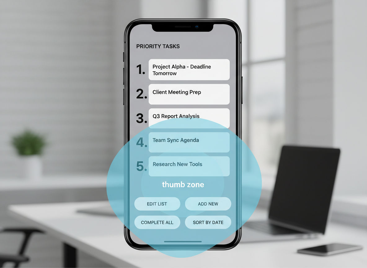
Consider thumb reach zones. Most people hold phones one-handed, using their thumb for navigation. The easiest-to-reach area forms an arc across the bottom third of the screen. Place your most important actions—like "Buy Now" or "Call Us"—within this natural thumb zone. Less critical features can sit higher on the screen.
Performance Optimization Is Non-Negotiable
Mobile users often operate on slower connections than desktop users. They might be on 4G networks, public WiFi, or in areas with poor coverage. Your site needs to load quickly regardless of connection quality.
Set a performance budget before you start designing. Aim for a total page weight under 1MB for initial load. Each image, script, and stylesheet counts against this budget. If adding a feature pushes you over budget, something else must go or be optimized.
Lazy loading delays loading images and content until users scroll to them. This dramatically improves initial page load time. Users see your critical above-the-fold content immediately while additional elements load in the background.
Critical rendering path optimization ensures the most important content displays first. Inline critical CSS directly in your HTML head. Defer non-essential JavaScript until after the page renders. This creates the perception of speed even when total load time remains unchanged.
Simplified Navigation Structures
Complex mega-menus don't work on mobile screens. You need streamlined navigation that helps users find what they need without overwhelming them. The hamburger menu (three horizontal lines) has become a standard mobile pattern because it hides navigation until needed.
Quick question
Want to turn this into a real plan?
If you want expert help with strategy, design, development, marketing, or automation — we’ll recommend the fastest path forward for your goals.
Limit your main navigation to 5-7 items maximum. If you have more pages, organize them into logical categories. Use clear, descriptive labels rather than clever branding terms. "Services" works better than "What We Do" for quick scanning.
Include a persistent search function. Many mobile users prefer searching to navigating through menus. Place a visible search icon in your header that expands into a search field when tapped.
Breadcrumbs help users understand where they are in your site structure. They're especially valuable on mobile where screen space limits other orientation cues. Keep breadcrumbs compact but tappable, allowing users to jump back to previous sections easily.
Mobile Optimization Best Practices
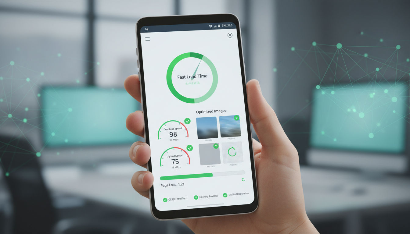
Page load speed determines whether users stay or leave. Google research shows that as page load time increases from one to three seconds, bounce probability increases by 32%. When load time reaches five seconds, bounce probability jumps to 90%. Your mobile site needs to be fast—not just acceptable, but genuinely fast.
Start by measuring your current performance. Google PageSpeed Insights provides detailed analysis and specific recommendations. Core Web Vitals—Largest Contentful Paint, First Input Delay, and Cumulative Layout Shift—have become crucial ranking factors. These metrics measure real user experience rather than theoretical performance.
Image and Media Optimization Techniques
Images typically account for 50-70% of total page weight. Optimizing them creates the single biggest performance improvement for most websites. Modern image formats like WebP offer 25-35% better compression than traditional JPEG files while maintaining visual quality.
Implement responsive images using the srcset attribute. This serves different image sizes based on the user's screen dimensions and resolution. A mobile user doesn't need your 2000-pixel-wide hero image—a 800-pixel version looks identical on their screen and loads three times faster.
Compress all images before uploading. Tools like TinyPNG or ImageOptim reduce file sizes by 50-80% without noticeable quality loss. Set a maximum width for images based on your design's widest container. Never upload images larger than they'll be displayed.
Video content requires special consideration. Autoplay videos consume bandwidth and annoy users. Provide play controls and let users choose when to start video content. Use poster images—static thumbnails that display before video plays—to give users a preview while keeping initial load times fast.
Mobile-Friendly Typography Principles
Text readability on small screens requires different approaches than desktop design. Minimum font size for body text should be 16 pixels. Anything smaller forces users to pinch and zoom, creating immediate frustration. Many designers resist this size, thinking it looks too large. But remember: readability trumps aesthetics on mobile.
Line height (the space between lines of text) should be 1.4 to 1.6 times your font size. Tighter line spacing makes text harder to read on small screens. Generous line height improves readability significantly, especially for longer content blocks.
Line length matters more on mobile than desktop. Aim for 50-75 characters per line. Longer lines tire readers' eyes as they track from end to beginning of the next line. Since mobile screens are narrower, this often happens naturally, but check your landscape orientation too.
Contrast ensures text remains readable in various lighting conditions. Mobile devices are used everywhere—in bright sunlight, dim restaurants, and everything between. Maintain a contrast ratio of at least 4.5:1 for normal text and 3:1 for large text. Pure black on pure white can be harsh; slightly softening both colors often improves readability.
Strategic Use of Whitespace
Whitespace (or negative space) isn't wasted space—it's a crucial design element. On mobile, generous whitespace prevents interfaces from feeling cramped and overwhelming. It guides users' eyes to important elements and creates visual breathing room.
Add padding around text blocks, buttons, and images. Elements that touch screen edges or each other create visual tension and confusion. Even 15-20 pixels of padding dramatically improves the sense of organization and professionalism.
Vertical spacing between sections helps users understand content structure. Use consistent spacing patterns throughout your site. For example, 40 pixels between major sections and 20 pixels between related elements creates clear visual hierarchy.
Form Design for Mobile Completion
Forms are often where mobile experiences break down. Desktop forms with multiple columns, tiny checkboxes, and complex validation don't work on mobile. Simplify ruthlessly. Every field you remove increases completion rates.
Stack form fields vertically, one per row. Side-by-side fields force zooming and horizontal scrolling. Each field should span the full width of its container, making it easy to tap and fill.
Use appropriate input types. Setting type="tel" for phone numbers brings up the numeric keypad. Using type="email" provides quick access to @ and .com. These small details reduce friction significantly.
Auto-fill and auto-complete save users time and reduce errors. Implement browser auto-fill support by using standard field names like "name," "email," and "tel." For addresses, integrate with services like Google Places API to let users select their address from suggestions.
Provide clear, immediate feedback. Show field validation in real-time rather than waiting until form submission. If an email format is incorrect, tell users immediately so they can fix it. Success messages should be obvious and reassuring.
Responsive Design Integration
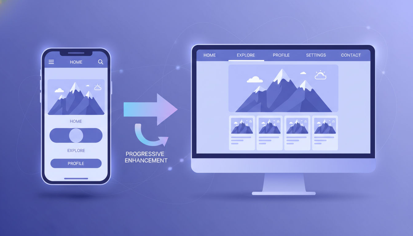
Responsive design and mobile-first design work together, not in opposition. Mobile-first defines your development approach—starting with mobile and scaling up. Responsive design provides the technical framework that makes your site adapt to any screen size. Think of mobile-first as your strategy and responsive design as your execution method.
This integration ensures users get optimal experiences whether they're on a smartphone, tablet, laptop, or large desktop monitor. The same codebase serves all devices, but the presentation adapts intelligently to each context.
Breakpoint Strategy for 2026
Breakpoints are the screen widths where your layout changes to accommodate different devices. Rather than designing for specific devices, modern breakpoint strategy focuses on where your content naturally needs to reflow. This approach remains relevant as new devices with unique dimensions constantly emerge.
Start with your mobile design (typically 320-375px width). This is your base. Your first breakpoint usually occurs around 768px, where you have room to display content in multiple columns or add a tablet-optimized layout. The next major breakpoint typically sits around 1024-1200px for desktop displays.
However, these aren't rigid rules. Add breakpoints where your content breaks, not where devices exist. If your navigation becomes cramped at 650px, add a breakpoint there. If your three-column layout needs adjustment at 900px, that's where your breakpoint belongs.
Consider portrait and landscape orientations separately. A tablet in portrait mode behaves more like a large phone. In landscape, it's closer to a small laptop. Use orientation-specific media queries when layouts need significant changes between these modes.
Flexible Grid Systems
Grid systems provide structure and consistency across screen sizes. Modern CSS Grid and Flexbox make creating flexible layouts easier than ever. These tools let you define responsive behavior directly in your CSS without relying on heavy frameworks.
CSS Grid excels at two-dimensional layouts where you need precise control over rows and columns. Define your grid once, then use media queries to adjust column counts and spacing at different breakpoints. A four-column product grid on desktop might become two columns on tablet and a single column on mobile.
Flexbox works beautifully for one-dimensional layouts—navigation menus, card layouts, or any content that flows in a single direction. Flex items automatically adjust their size to fill available space. This creates naturally responsive designs with minimal code.
Use relative units like percentages, em, or rem rather than fixed pixels. A container set to 90% width automatically adapts to any screen size. Font sizes defined in rem scale proportionally, maintaining your typographic hierarchy across devices.
CSS Frameworks and Modern Tools
CSS frameworks like Bootstrap, Tailwind, or Foundation provide pre-built responsive components and grid systems. These can accelerate development, especially for teams without deep CSS expertise. However, they often include significant unused code that slows page load times.
If you use a framework, customize it. Remove unused components and styles. Many frameworks offer build tools that generate only the CSS you actually use. This keeps your codebase lean while still benefiting from the framework's responsive foundation.
CSS custom properties (variables) make managing responsive design easier. Define breakpoints, spacing values, and color schemes as variables. Adjust these variables at different breakpoints to create consistent, maintainable responsive behavior throughout your site.
Container queries, a newer CSS feature, let elements respond to their container's size rather than the viewport width. This creates truly modular components that adapt to their context. A sidebar widget can adjust its layout based on sidebar width, regardless of overall screen size.
Testing Across Devices and Screen Sizes
Real device testing remains essential despite sophisticated browser tools. Emulators and responsive design modes help during development, but they don't perfectly replicate actual device behavior. Touch interactions, scrolling physics, and performance characteristics differ between emulation and real hardware.
Test on a range of actual devices representing different screen sizes, operating systems, and age ranges. Include at least one small phone (iPhone SE or similar), one large phone (iPhone Pro Max or Android equivalent), one tablet, and one desktop display. Older devices reveal performance issues that newer hardware masks.
Browser developer tools provide responsive design modes for quick testing. Chrome DevTools and Firefox Developer Tools let you simulate various screen sizes and test different network conditions. Use these during development for rapid iteration, then validate on real devices before launch.
Automated testing tools like BrowserStack or Sauce Labs let you test across hundreds of device and browser combinations without maintaining a physical device lab. These services are particularly valuable for catching edge cases and ensuring compatibility with devices you don't own.
Mobile UX Design Essentials
Thumb zone optimization acknowledges how people actually hold and use their phones. MIT research found that 49% of users hold phones one-handed, 36% cradle them in one hand while tapping with the other, and only 15% use two hands. Your design should accommodate all these grip patterns, but prioritize one-handed use.
The thumb zone maps the comfortable reach area when holding a phone one-handed. The easiest-to-reach area forms an arc across the lower third of the screen. The bottom corners—especially the bottom left for right-handed users—are hardest to reach. The top of the screen requires stretching or adjusting grip.
Strategic Element Placement
Place primary actions in the natural thumb zone. "Add to Cart," "Submit," "Next," and other frequently-used buttons belong in the easy-reach area. Navigation elements, especially bottom navigation bars, work well in this zone because users access them constantly.
Secondary actions can sit higher on the screen. Settings, help links, and less-critical features are acceptable in the stretch zone. Users will adjust their grip for occasional actions but shouldn't need to for primary tasks.
Avoid placing destructive actions (delete, cancel, close) in the easy-reach zone. Accidental taps on these functions frustrate users. Position them higher on screen or require confirmation before executing.
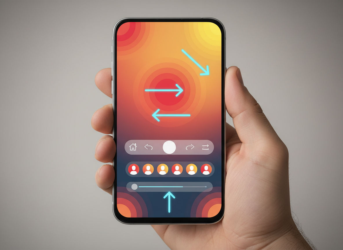
Gesture-Based Interactions
Modern mobile users expect gesture controls. Swiping, pinching, and pulling have become intuitive interaction patterns. Incorporating these gestures creates more natural, efficient experiences than relying solely on buttons and menus.
Swipe gestures work well for navigating between related items—photo galleries, product carousels, or article lists. Horizontal swipes feel natural for moving forward and backward through content. Vertical swipes are reserved for scrolling, so avoid conflicting with this fundamental behavior.
Pull-to-refresh has become a standard pattern for updating content feeds. Users instinctively pull down from the top of a page expecting fresh content. Implementing this pattern meets user expectations and reduces the need for explicit refresh buttons.
However, don't rely exclusively on hidden gestures. Not all users discover gesture controls intuitively. Provide visible alternatives for critical actions. A swipeable carousel should also include arrow buttons. Gesture controls enhance efficiency for experienced users without excluding those who prefer traditional interactions.
Micro-Interactions and Feedback
Micro-interactions are small, subtle responses to user actions. A button that changes color when tapped, a form field that highlights when focused, or a loading spinner that appears during processing. These tiny details dramatically impact perceived quality and usability.
Immediate visual feedback confirms that the system registered the user's action. Without feedback, users wonder if their tap worked and often tap again, creating duplicate actions. A simple color change or subtle animation provides instant reassurance.
Loading states prevent confusion during processing. When users submit a form or load new content, show progress indicators. Even a simple animated spinner tells users the system is working. For longer processes, provide percentage completion or estimated time remaining.
Error prevention works better than error correction. Disable submit buttons until required fields are complete. Show password strength in real-time. Provide format examples for phone numbers or dates. These proactive micro-interactions reduce frustration and support task completion.
Accessibility Considerations
Accessible design serves everyone, not just users with disabilities. Clear labels, sufficient contrast, and logical structure benefit all users, especially on mobile where context and attention are limited. Accessibility and mobile optimization share many principles—simplicity, clarity, and efficiency.
Color contrast affects readability for users with visual impairments and anyone using their phone in bright sunlight. Maintain 4.5:1 contrast for normal text and 3:1 for large text. Test your designs with contrast checking tools to ensure compliance.
Touch target size matters for users with motor control difficulties and anyone trying to tap accurately on a moving bus. Minimum 44x44 pixel targets aren't just an Apple guideline—they're an accessibility requirement that improves everyone's experience.
Screen reader support ensures users with visual impairments can navigate your site. Use semantic HTML elements (<nav>, <main>, <article>) that convey structure. Add descriptive alt text to images. Label form fields clearly. These practices improve SEO while supporting accessibility.
Reducing Cognitive Load
Cognitive load refers to the mental effort required to use your interface. Mobile contexts—distraction, time pressure, smaller screens—already increase cognitive load. Your design should minimize additional mental burden.
Limit choices on each screen. Research shows that too many options cause decision paralysis. Present 3-5 primary choices rather than overwhelming users with every possible action. Use progressive disclosure to reveal additional options only when needed.
Maintain consistency throughout your interface. Navigation placement, button styles, and interaction patterns should remain predictable. When users learn how one part of your site works, that knowledge should transfer to other sections. Consistency reduces the learning curve and mental effort.
Use familiar patterns and conventions. The hamburger menu icon, shopping cart symbol, and magnifying glass for search are universally recognized. Inventing new icons or interaction patterns forces users to learn your unique system rather than relying on existing knowledge.
Provide clear next steps at every point. Users shouldn't wonder "what do I do now?" Guide them through processes with obvious calls-to-action and logical flow. Breadcrumbs, progress indicators, and contextual help reduce uncertainty and cognitive load.
Technical Implementation Strategies
Mobile-first CSS means writing your base styles for mobile, then using media queries to enhance layouts for larger screens. This approach keeps your CSS organized and typically results in less code overall. You're adding complexity for capable devices rather than removing it for constrained ones.
Start with your mobile styles outside any media queries. These become your default. Then use min-width media queries to add styles as screen size increases. This progressive approach aligns with the mobile-first philosophy at the code level.
/* Base mobile styles */
.container {
  padding: 15px;
  width: 100%;
}

/* Tablet and larger */
@media (min-width: 768px) {
  .container {
    padding: 30px;
    max-width: 720px;
    margin: 0 auto;
  }
}

/* Desktop */
@media (min-width: 1024px) {
  .container {
    max-width: 960px;
  }
}
This structure is cleaner and more maintainable than desktop-first approaches using max-width queries. You can clearly see how your design evolves as screen size increases.
JavaScript Performance Considerations
JavaScript execution significantly impacts mobile performance. Mobile processors are less powerful than desktop CPUs, so code that runs smoothly on a laptop might lag on a phone. Minimize JavaScript where possible and optimize what remains.
Next step
Ready for a quote and timeline?
Send a quick note with what you’re building, your deadline, and what success looks like — we’ll reply with clear next steps.
Defer non-critical JavaScript until after page load. Use the defer or async attributes on script tags to prevent blocking page rendering. Critical JavaScript for above-the-fold functionality can load synchronously, but everything else should wait.
Code splitting breaks your JavaScript into smaller chunks loaded only when needed. A user viewing your homepage doesn't need the code for your checkout process. Bundle only the JavaScript required for each page, reducing initial load time.
Avoid JavaScript frameworks for simple sites. A small business website probably doesn't need React or Vue. These frameworks add significant overhead. Vanilla JavaScript or lightweight libraries like Alpine.js provide interactivity without the performance penalty.
API and Backend Optimization
Mobile-first design extends beyond the frontend. Your APIs and backend services must support fast mobile experiences. Slow server responses negate all frontend optimization efforts.
Implement API response caching to reduce server load and response times. Frequently-requested data that doesn't change often can be cached at the CDN level or in the browser. Set appropriate cache headers to balance freshness with performance.
Minimize payload size by sending only necessary data. Mobile devices don't need high-resolution images or verbose API responses. Implement responsive image serving on the backend. Return different image sizes based on device capabilities.
Use GraphQL or similar technologies to let clients request exactly the data they need. Traditional REST APIs often return more information than required, wasting bandwidth. Precise data fetching reduces transfer sizes and parsing time.
Consider implementing service workers for offline functionality and background sync. Service workers cache critical assets and content, enabling your site to work without connectivity. This creates app-like experiences that handle unreliable mobile networks gracefully.
Progressive Web Apps (PWAs)
Progressive Web Apps bridge the gap between websites and native mobile apps. They offer offline functionality, push notifications, and home screen installation while remaining web-based. For many businesses, PWAs provide app-like experiences without the cost and complexity of developing native apps.
PWAs require three core components: HTTPS, a web app manifest, and a service worker. The manifest defines how your app appears when installed—icon, name, colors. The service worker handles caching and offline functionality.
Offline support dramatically improves mobile experience. Users can access cached content even without connectivity. For e-commerce sites, users can browse products offline and complete purchases when connection resumes. For content sites, articles remain readable anywhere.
Installation prompts let users add your site to their home screen with a single tap. Once installed, your PWA launches like a native app, without browser chrome. This increases engagement—installed PWAs see 2-5x higher engagement rates than mobile websites.
Push notifications re-engage users even when they're not actively using your site. However, use notifications judiciously. Irrelevant or excessive notifications lead to uninstalls. Focus on genuinely valuable updates that users want to receive. At Vohrtech, we help clients develop notification strategies that enhance rather than annoy user experience.
Measuring Mobile Design Success
Key performance indicators tell you whether your mobile-first design actually works. Vanity metrics like page views don't reveal user experience quality. Focus on metrics that indicate engagement, satisfaction, and business outcomes.
Mobile conversion rate measures how effectively your mobile site drives desired actions—purchases, signups, contact form submissions. Compare mobile and desktop conversion rates. A significant gap suggests mobile experience issues. Aim for mobile rates within 10-20% of desktop rates.
Page load time directly correlates with bounce rate and conversions. Track Core Web Vitals—Largest Contentful Paint (LCP), First Input Delay (FID), and Cumulative Layout Shift (CLS). Google Search Console provides these metrics for your actual users, not just lab tests.
Mobile bounce rate indicates whether users find what they need. High bounce rates suggest slow loading, poor content relevance, or usability issues. However, context matters—a contact page with a high bounce rate might be successful if users found your phone number and called.
Analytics and User Behavior Tracking
Google Analytics 4 provides detailed mobile user behavior insights. Segment your data by device type to understand how mobile users differ from desktop visitors. Look at popular pages, entry points, and exit pages specifically for mobile traffic.
Session duration and pages per session indicate engagement. Mobile sessions are typically shorter than desktop, but extremely brief sessions suggest users aren't finding value. Compare your mobile metrics to industry benchmarks for context.
Event tracking reveals how users interact with specific elements. Track button clicks, form submissions, video plays, and other interactions. This data shows whether users discover and use your primary calls-to-action.
Heat mapping tools like Hotjar or Crazy Egg visualize where mobile users tap, how far they scroll, and where they spend time. These visual insights often reveal usability issues that raw analytics miss. You might discover users repeatedly tapping non-interactive elements or abandoning forms at specific fields.
A/B Testing for Mobile Experiences
A/B testing validates design decisions with real user data. Rather than guessing what works, you can test variations and measure actual impact. Mobile-specific tests often reveal different preferences than desktop testing.
Test one variable at a time for clear results. Change button color, placement, or text—but not all three simultaneously. This isolates which change drove any performance difference. Common mobile tests include button size, form length, navigation style, and content hierarchy.
Ensure statistical significance before declaring a winner. Small sample sizes produce unreliable results. Most A/B testing tools calculate confidence levels automatically. Aim for 95% confidence before implementing changes.
Mobile-specific considerations affect test design. Screen size variations mean a change that works on large phones might fail on small ones. Segment results by device size to understand these nuances.
Continuous Improvement Processes
Mobile-first design isn't a one-time project—it's an ongoing commitment. User behavior evolves, new devices emerge, and your business needs change. Establish processes for regular review and optimization.
Conduct quarterly mobile experience audits. Review analytics, test on current devices, and check for technical issues. Mobile operating system updates sometimes break previously working features. Regular testing catches these problems before they significantly impact users.
Gather user feedback directly through surveys or user testing sessions. Analytics show what users do, but feedback reveals why. Users might abandon your checkout process because a specific field is confusing, information you won't get from quantitative data alone.
Monitor mobile search rankings and Core Web Vitals in Google Search Console. Google's mobile-first indexing means your mobile site determines your search visibility. Declining rankings often correlate with mobile experience issues.
Stay informed about mobile design trends and best practices. The mobile landscape changes rapidly. New interaction patterns, device capabilities, and user expectations emerge constantly. Following industry publications and attending web development communities keeps your skills current.
If you're looking to improve your mobile experience but aren't sure where to start, our team can conduct a comprehensive mobile audit and provide actionable recommendations. We've helped businesses throughout Montreal and beyond transform their mobile presence and see measurable results.
Conclusion
Mobile-first design has shifted from optional to essential. Your users are already mobile—over 60% of web traffic comes from phones and tablets. Meeting them where they are means designing for mobile contexts first, then enhancing for larger screens.
The principles in this guide—progressive enhancement, content prioritization, performance optimization, and user-centered design—create experiences that work beautifully across all devices. More importantly, they respect your users' time and attention, building trust and driving business results.
Start implementing these strategies today. Audit your current mobile experience, identify the biggest pain points, and prioritize improvements based on user impact. Mobile-first design is an investment that pays dividends through better user engagement, higher conversions, and improved search visibility.
The future of web design is already here, and it's mobile. Your next step is making sure your digital presence reflects this reality. Check out our portfolio to see mobile-first design in action, or reach out to discuss how we can help transform your mobile experience.