Introduction
Imagine spending thousands of dollars driving traffic to your website, only to watch visitors leave without taking action. It's frustrating, expensive, and unfortunately common. Many businesses focus exclusively on getting more visitors while ignoring the gold mine sitting right in front of them: converting the traffic they already have.
Conversion rate optimization (CRO) is the systematic process of increasing the percentage of website visitors who complete a desired action. Whether that's making a purchase, filling out a form, or signing up for a newsletter, CRO helps you get more value from your existing traffic.
Here's the reality: improving your conversion rate by just 1% can have the same impact as doubling your traffic. That's not an exaggeration. If you have 10,000 monthly visitors with a 2% conversion rate, you're getting 200 conversions. Increase that to 3%, and you're at 300 conversions without spending an extra dollar on advertising.
But where do you start? That's where a conversion rate optimization template becomes invaluable. A CRO template provides a structured, repeatable framework for identifying conversion barriers, implementing improvements, and tracking results. It removes guesswork and ensures you're covering all the essential elements that influence user behavior.
This guide is designed for business owners, marketing managers, and anyone responsible for website performance. Whether you're running a local Montreal business or managing an enterprise-level site, these templates will give you a clear roadmap for optimization. You don't need to be a technical expert or have a massive budget. You just need a systematic approach and the willingness to test, learn, and improve.
We'll walk through every component of an effective CRO template, from initial audits to ongoing testing frameworks. By the end, you'll have actionable checklists and templates you can implement immediately.
Understanding Conversion Rate Optimization Fundamentals
Before diving into templates, you need to understand what actually drives conversions. Too many businesses jump straight to tactics without grasping the underlying principles. This leads to random changes that rarely move the needle.
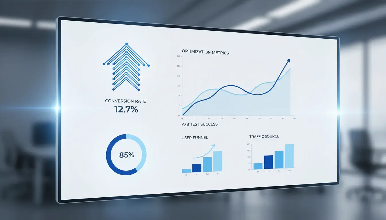
Key CRO Metrics That Matter
Your conversion rate is the foundation metric, calculated by dividing conversions by total visitors. But that's just the starting point. Bounce rate tells you how many people leave without interacting with your site. A high bounce rate often signals a mismatch between what visitors expected and what they found.
Average time on page reveals engagement levels. Visitors who spend more time are typically more interested and closer to converting. However, context matters. A quick visit to a contact page followed by a phone call is actually a success story.
Click-through rate (CTR) measures how many people click on your calls-to-action. Low CTRs indicate your messaging isn't compelling or your buttons aren't visible enough. Form abandonment rate shows where people start but don't complete your conversion process. This metric is gold for identifying friction points.
Cart abandonment rate specifically tracks e-commerce drop-offs. The average is around 70%, meaning most people who add items never complete checkout. Even small improvements here can dramatically impact revenue.
Exit rate differs from bounce rate by showing where visitors leave after viewing multiple pages. High exit rates on key pages signal problems that need attention.
The ROI of Conversion Optimization
CRO delivers some of the highest returns in digital marketing. Unlike paid advertising, where costs scale with results, conversion improvements compound over time. Fix a conversion barrier once, and every future visitor benefits.
Consider the math. If you spend $5,000 monthly on ads generating 10,000 visitors at a 2% conversion rate, you're paying $25 per conversion. Improve that rate to 3%, and your cost per conversion drops to $16.67. That's a 33% improvement in efficiency without changing your ad spend.
The beauty of CRO is that it works alongside every other marketing effort. Better SEO rankings? Those visitors convert at a higher rate. More social media traffic? They're more likely to take action. Email campaigns? Higher click-to-conversion rates mean better campaign ROI.
Research consistently shows that companies investing in CRO see average returns of 223%. That's higher than most other digital marketing channels. The reason is simple: you're optimizing an asset you already own rather than renting attention through ads.
Common Conversion Barriers
Understanding what stops conversions is as important as knowing what drives them. Slow page load times are conversion killers. Research shows that a one-second delay can reduce conversions by 7%. Mobile users are even less patient.
Confusing navigation frustrates visitors who can't find what they need. If people have to think too hard about where to click, they'll leave. Your site structure should feel intuitive, not like a puzzle.
Weak value propositions fail to communicate why visitors should choose you. If someone can't quickly understand what you offer and why it matters, they won't stick around to figure it out.
Lack of trust signals makes visitors hesitant. Missing contact information, no customer reviews, poor design quality, or security concerns all trigger doubt. People won't convert if they don't trust you.
Complicated forms ask for too much information too soon. Every additional field reduces completion rates. If you're asking for someone's life story before they've even experienced your value, you're creating unnecessary friction.
Poor mobile experience alienates the growing majority of mobile users. If your site isn't optimized for smaller screens, you're losing conversions every day.
Unclear calls-to-action leave visitors uncertain about next steps. Buttons that say "Submit" or "Click Here" don't motivate action like "Get My Free Guide" or "Start Saving Money Today."
Essential Components of a CRO Template
A comprehensive conversion rate optimization template isn't just a checklist. It's a complete system for understanding your current performance, identifying opportunities, implementing changes, and measuring results. Each component serves a specific purpose in the optimization process.
Baseline Analytics and Data Collection
You can't improve what you don't measure. Your CRO template must start with establishing baseline metrics. This means documenting your current conversion rates across all key pages and funnels before making any changes.
Set up proper analytics tracking that captures every important user interaction. Google Analytics is the foundation, but you'll also want event tracking for button clicks, scroll depth, and form interactions. These micro-conversions reveal user intent even when they don't complete the final conversion.
Segment your data by traffic source, device type, and user behavior. Desktop visitors often behave differently than mobile users. Organic search traffic may convert differently than paid ads or social media referrals. Understanding these patterns helps you prioritize optimization efforts.
Document your current traffic volume and patterns. Seasonal businesses need to account for fluctuations. If you're comparing January data to December data for a retail site, you're not getting accurate insights.
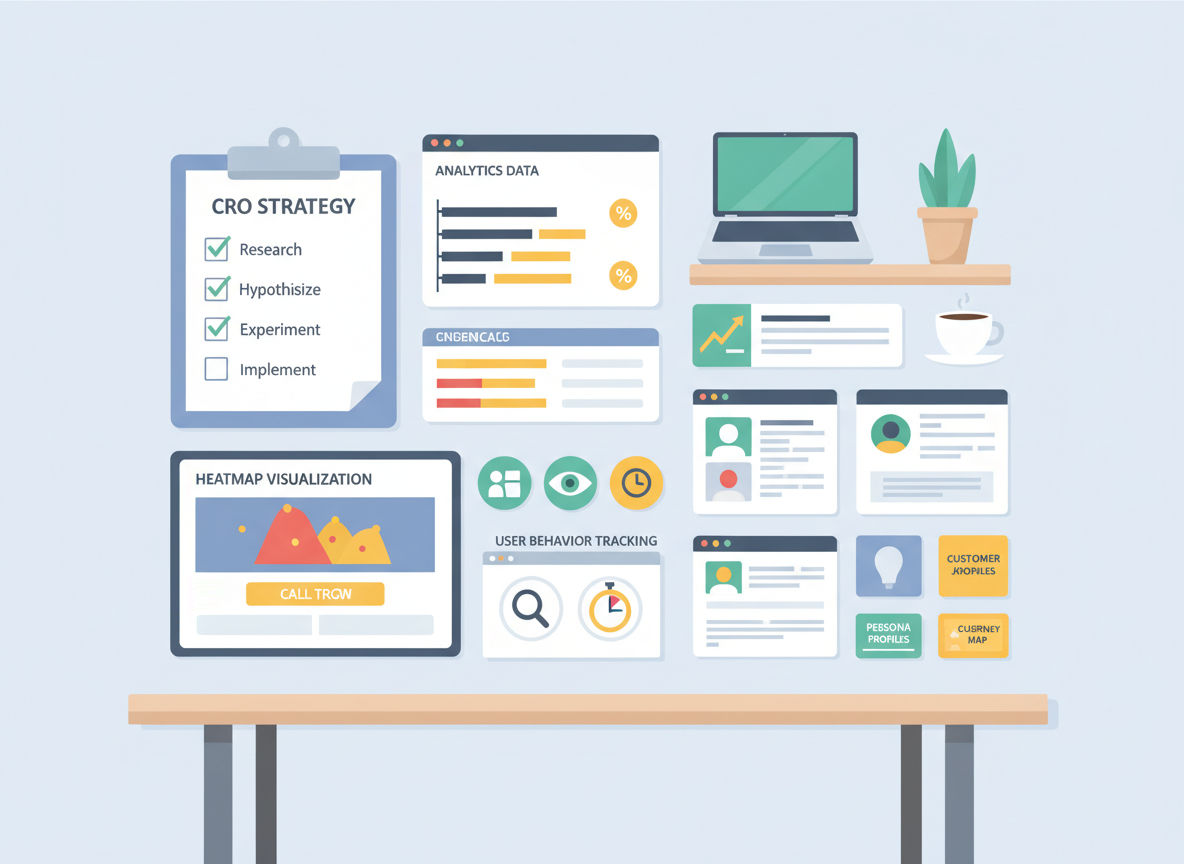
User Behavior Tracking Elements
Numbers tell you what's happening, but user behavior tracking shows you why. Heatmaps reveal where people click, how far they scroll, and what elements attract attention. You'll often discover that visitors ignore important content or click on elements that aren't actually clickable.
Quick question
Want to turn this into a real plan?
If you want expert help with strategy, design, development, marketing, or automation — we’ll recommend the fastest path forward for your goals.
Session recordings let you watch real visitors navigate your site. This qualitative data is invaluable for understanding friction points that analytics alone can't reveal. You'll see people hesitate, backtrack, or struggle with specific elements.
Form analytics track field-by-field interactions. Which fields do people spend the most time on? Where do they abandon the form? This granular data helps you streamline the conversion process.
User surveys and feedback tools provide direct insights into visitor concerns. Sometimes the simplest way to understand conversion barriers is to ask. Tools like exit-intent surveys can capture feedback from people who are about to leave.
Conversion Funnel Mapping
Your CRO template needs a clear map of every conversion path on your site. This isn't just the obvious checkout process. It includes newsletter signups, contact form submissions, account creations, and any other desired action.
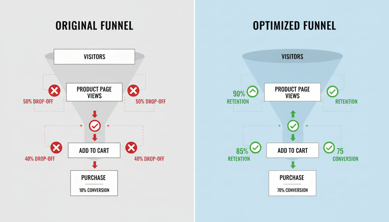
Document each step in the funnel with drop-off rates. If 1,000 people land on your product page, 300 add to cart, 150 start checkout, and 75 complete purchase, you have a 7.5% overall conversion rate. But you also have specific drop-off points to address.
Identify alternative paths users take. Not everyone follows your intended journey. Some people browse multiple pages before converting. Others jump straight to contact. Understanding these patterns helps you optimize the actual user experience, not just your idealized version.
Map out micro-conversions that indicate interest. Someone who views your pricing page three times is showing strong intent even if they haven't converted yet. These signals help you understand the customer journey.
Testing Framework Structure
Your template must include a structured approach to testing. This means documenting what you'll test, why you're testing it, how you'll measure success, and what you'll do with the results.
Create a hypothesis template for every test. "If we [make this change], then [this metric] will improve because [this reason]." This forces you to think strategically rather than making random changes.
Establish statistical significance requirements. Don't call a test a winner after 50 visitors. You need enough data to be confident the results aren't just random variation. Most tests need at least 250-350 conversions per variation.
Build a testing calendar that prioritizes high-impact opportunities. You can't test everything at once. Focus on pages with the most traffic and the biggest conversion gaps first.
Document every test with before-and-after data, screenshots, and lessons learned. This creates institutional knowledge that prevents you from repeating failed experiments or forgetting successful ones.
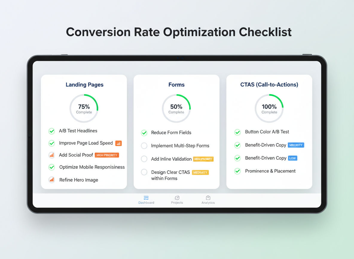
The Complete Conversion Rate Optimization Template
Now let's get into the practical templates you can use immediately. These frameworks cover every major aspect of conversion optimization, from initial audits through ongoing improvements.
Pre-Optimization Audit Checklist
Start with a comprehensive audit of your current state. Review your analytics setup to ensure accurate tracking. Check that conversion goals are properly configured, tracking codes are firing correctly, and you're not losing data to technical issues.
Analyze your top landing pages by traffic and conversion rate. These are your highest-impact optimization opportunities. A 1% improvement on a page getting 10,000 monthly visitors beats a 10% improvement on a page getting 100 visitors.
Document your current conversion funnel performance. Where are the biggest drop-offs? Which pages have the highest exit rates? What's your average time to conversion?
Review your mobile versus desktop performance. If mobile conversion rates are significantly lower, that's a clear priority area. With mobile traffic often exceeding 60% of total visits, mobile optimization isn't optional.
Examine your page load speeds across devices. Use tools like Google PageSpeed Insights to identify technical issues. Pages loading in under two seconds convert significantly better than those taking five seconds or more.
Assess your current value proposition clarity. Can a first-time visitor understand what you offer within five seconds? If not, that's your starting point.
Check for trust signals including contact information, customer reviews, security badges, and professional design quality. Missing elements here create immediate doubt.
Page-by-Page Optimization Checklist
Create a standardized checklist for optimizing any page on your site. This ensures consistency and comprehensive coverage.
Above-the-fold content should immediately communicate value. Your headline needs to grab attention and communicate benefit. Supporting copy should reinforce the message without overwhelming visitors.
Visual hierarchy guides eyes toward important elements. Use size, color, contrast, and white space to direct attention. Your primary call-to-action should be the most visually prominent element.
Call-to-action optimization includes button placement, color, size, and copy. Test action-oriented language that emphasizes benefit. "Get Your Free Analysis" outperforms "Submit" every time.
Social proof placement matters as much as having it. Customer testimonials, case studies, client logos, and review ratings should appear near decision points, not buried at the bottom of pages.
Clear next steps eliminate confusion. Every page should have an obvious primary action and logical secondary options. Don't make visitors guess what to do.
Mobile Conversion Optimization
Mobile optimization deserves its own template because mobile users behave differently. Touch targets need to be large enough for fingers, not mouse cursors. Buttons should be at least 44x44 pixels.
Simplify mobile forms to the absolute minimum. Every field you can eliminate improves completion rates. Consider using mobile-friendly input types that trigger appropriate keyboards.
Reduce mobile page weight aggressively. Images should be compressed and properly sized. Remove unnecessary scripts that slow loading. Mobile users on cellular connections are especially sensitive to load times.
Make phone numbers clickable for one-tap calling. This simple change can dramatically increase contact rates from mobile visitors.
Ensure your mobile navigation is intuitive. Hamburger menus are acceptable, but critical pages should be easily accessible. Don't bury important content three clicks deep.
Test your forms on actual mobile devices, not just desktop browsers resized to mobile dimensions. Real-world testing reveals issues that simulators miss.
Form and CTA Optimization Template
Forms are conversion bottlenecks for most sites. Your template should address every element systematically.
Reduce form fields to the absolute minimum needed. Every field you remove increases completion rates by an average of 5-10%. Ask yourself: do you really need this information right now, or can you collect it later?
Use smart defaults and auto-fill where possible. If you can pre-populate fields based on known information, do it. Reduce the work visitors need to do.
Provide clear error messages that help users fix problems. "Invalid input" is frustrating. "Please enter a valid email address (example: name@domain.com)" is helpful.
Position your call-to-action buttons prominently with plenty of white space. They should stand out visually without looking out of place.
Test button copy that emphasizes benefit and reduces anxiety. "Start My Free Trial" is more compelling than "Submit." "Get Instant Access" works better than "Download."
Consider multi-step forms for complex conversions. Breaking a 20-field form into 4 steps with 5 fields each improves completion rates. Progress indicators show users how much remains.
Building Your Optimization Checklist
A comprehensive optimization checklist ensures you don't miss critical elements. These checklists should be specific enough to be actionable but flexible enough to apply across different page types.
Landing Page Optimization Items
Landing pages are designed for a single purpose, making them ideal optimization candidates. Your template should address every element that influences conversion decisions.
Headline clarity and benefit communication come first. Your headline should pass the five-second test: can visitors understand what you're offering and why it matters in five seconds or less?
Supporting copy should expand on your headline promise without creating walls of text. Use short paragraphs, bullet points, and subheadings to maintain readability. Focus on benefits over features.
Visual elements should support your message, not distract from it. Images of real people using your product or service outperform stock photography. Show the outcome, not just the product.
Form placement and complexity directly impact conversions. Above-the-fold forms convert better for high-intent traffic. Below-the-fold forms work better when you need to build value first.
Trust indicators should be strategically placed near conversion points. Security badges near payment forms, testimonials near pricing, and guarantees near call-to-action buttons all reduce anxiety at critical moments.
Page length should match visitor intent and offer complexity. Simple offers like newsletter signups need minimal copy. Complex B2B services require more information to build confidence. Test different lengths to find what works for your audience.
Navigation and User Experience Checks
Navigation might seem secondary to conversion elements, but confusing navigation kills conversions. Your checklist should ensure visitors can easily find what they need.
Menu structure should be logical and limited. Seven items or fewer in your main navigation prevents overwhelming visitors. Use clear, descriptive labels rather than clever names that require interpretation.
Search functionality should be prominent and effective. If visitors are searching, they're actively looking for something specific. Make search easy to find and ensure results are relevant.
Breadcrumb trails help visitors understand where they are in your site structure. This is especially important for e-commerce sites with deep category hierarchies.
Internal linking should guide visitors toward conversion points naturally. Link from blog posts to service pages, from product descriptions to related items, and from educational content to contact forms.
Footer navigation should provide access to important pages without cluttering your main menu. Contact information, policies, and secondary pages fit well here.
Trust and Credibility Elements
Trust isn't optional. Visitors won't convert if they don't trust you. Your checklist should verify that trust elements are present and prominent.
Contact information should be easily accessible. A physical address, phone number, and email address signal legitimacy. Hiding contact information raises red flags.
About page content should humanize your business. Photos of team members, your story, and your values build connection. People prefer doing business with people, not faceless corporations.
Customer reviews and testimonials should be specific and credible. Generic praise like "Great service!" is less effective than detailed stories with names and photos. Video testimonials are even more powerful.
Security indicators matter especially for e-commerce and sites collecting sensitive information. SSL certificates, payment security badges, and privacy policy links reduce anxiety.
Professional design quality signals credibility. Outdated designs, broken images, or inconsistent branding make visitors question your legitimacy. You don't need expensive design, but you need clean, professional presentation.
Speed and Performance Benchmarks
Performance directly impacts conversions. Your checklist should include specific benchmarks and testing protocols.
Page load time should be under two seconds for optimal conversion rates. Test on both desktop and mobile using real-world conditions. Tools like Google PageSpeed Insights and GTmetrix provide detailed analysis.
Image optimization is often the biggest performance win. Compress images without sacrificing quality, use appropriate formats (WebP where supported), and implement lazy loading for below-the-fold images.
Script optimization reduces render-blocking resources. Minimize JavaScript, defer non-critical scripts, and remove unused code. Every script adds load time and potential points of failure.
Server response time should be under 200 milliseconds. Slow servers impact every visitor. Quality hosting is an investment in conversion rates.
Mobile performance deserves separate testing. Mobile networks are slower than WiFi, and mobile processors are less powerful than desktops. What loads quickly on your office computer might crawl on a phone.
Implementing Conversion Templates Across Your Website
Different page types require different optimization approaches. Your templates should be customized for each major page type while maintaining consistent principles.
Homepage Conversion Template
Your homepage serves multiple audiences with different goals. Some visitors know exactly what they want; others are exploring options. Your template needs to accommodate both.
Clear value proposition should dominate the hero section. What do you do, who do you serve, and why should visitors care? Answer these questions immediately.
Primary call-to-action should reflect your most valuable conversion. For service businesses, this might be "Schedule a Consultation." For SaaS companies, "Start Free Trial" makes sense. Make this button impossible to miss.
Secondary navigation paths should address different visitor segments. If you serve both B2B and B2C markets, provide clear paths for each. If you offer multiple services, make each accessible.
Social proof should appear early. Customer logos, testimonial highlights, or impressive statistics build credibility quickly. Don't make visitors scroll to find proof you're legitimate.
Feature or benefit highlights should be scannable. Bullet points or icon-based sections let visitors quickly grasp your key differentiators. Three to five main points work well.
Product and Service Page Template
Product and service pages are where research turns into action. Your template should address every question that might prevent conversion.
Detailed descriptions should be benefit-focused first, then cover features. People care about what your product or service does for them before they care about technical specifications.
Pricing information should be clear and comprehensive. Hidden pricing forces visitors to contact you for basic information, adding friction. If your pricing is complex, provide ranges or starting prices.
Visual demonstrations through images, videos, or interactive elements help visitors understand what they're getting. Show your product in use or demonstrate your service process.
Comparison tools help visitors choose between options. If you offer multiple packages or products, make differences clear. Comparison tables work well for this purpose.
Objection handling should address common concerns proactively. If price is typically an objection, emphasize value and ROI. If implementation seems complex, highlight your support process.
Call-to-action placement should include multiple opportunities without being pushy. Top of page for high-intent visitors, after key information for those needing more details, and at the end for those who read everything.
Checkout and Lead Capture Templates
Checkout and lead capture pages are the final conversion hurdle. Every element should reduce friction and anxiety.
Progress indicators show visitors where they are in the process. Multi-step checkouts with clear progress bars have higher completion rates than single long forms.
Guest checkout options reduce friction for first-time customers. Forcing account creation before purchase abandons sales. Let people buy first, create accounts later.
Next step
Ready for a quote and timeline?
Send a quick note with what you’re building, your deadline, and what success looks like — we’ll reply with clear next steps.
Security reassurance should be prominent near payment information. SSL badges, secure payment logos, and money-back guarantees reduce purchase anxiety.
Exit intent offers can recover abandoning visitors. A popup triggered when someone moves to close the tab can offer help, discounts, or simply ask what's preventing completion.
Error prevention is better than error correction. Validate form fields in real-time so users fix mistakes immediately rather than discovering problems after clicking submit.
Thank You Page Optimization
Thank you pages are missed optimization opportunities. Visitors just converted, making them highly engaged and receptive to next steps.
Confirmation messaging should be clear and reassuring. Tell people exactly what happens next and when to expect it. Uncertainty creates buyer's remorse.
Social sharing encouragement leverages enthusiasm. Someone who just purchased or signed up is likely willing to share with their network if you make it easy.
Next step guidance keeps engagement going. Suggest related content, additional products, or ways to get more value from what they just purchased.
Expectation setting prevents support questions. If they'll receive an email confirmation, say so. If processing takes 24 hours, communicate that clearly.
Testing and Validation Framework
Templates provide structure, but testing validates what actually works. Your framework should make testing systematic and data-driven.
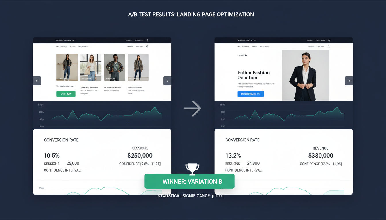
A/B Testing Protocol
A/B testing compares two versions to determine which performs better. Your protocol should ensure tests are set up correctly and run long enough to produce reliable results.
Hypothesis formation comes before testing. Write down what you're testing, why you believe it will improve conversions, and what metric will measure success. This prevents random changes without strategic thinking.
Single variable testing isolates what actually caused results. Testing multiple changes simultaneously makes it impossible to know which change mattered. Test one element at a time for clear insights.
Sample size requirements ensure statistical validity. Most tests need at least 250-350 conversions per variation. Running tests with insufficient data leads to false conclusions.
Test duration should account for weekly patterns. Running a test only on weekdays might miss weekend behavior. Most tests should run at least one full week, preferably two.
Statistical significance thresholds prevent premature conclusions. A 95% confidence level is standard, meaning you're 95% certain the results aren't due to chance. Don't call winners too early.
Prioritization Matrix
You can't test everything at once. A prioritization matrix helps focus on high-impact opportunities.
Impact assessment estimates potential conversion lift. Changes to high-traffic pages with clear problems have more impact than minor tweaks to low-traffic pages.
Implementation difficulty affects prioritization. Quick wins that require minimal technical work should be prioritized over complex changes with uncertain payoff.
Confidence level reflects how certain you are the change will improve conversions. Changes based on user research and established best practices deserve higher priority than hunches.
Score each potential test on these three dimensions, then prioritize based on combined scores. Focus on high-impact, low-difficulty, high-confidence opportunities first.
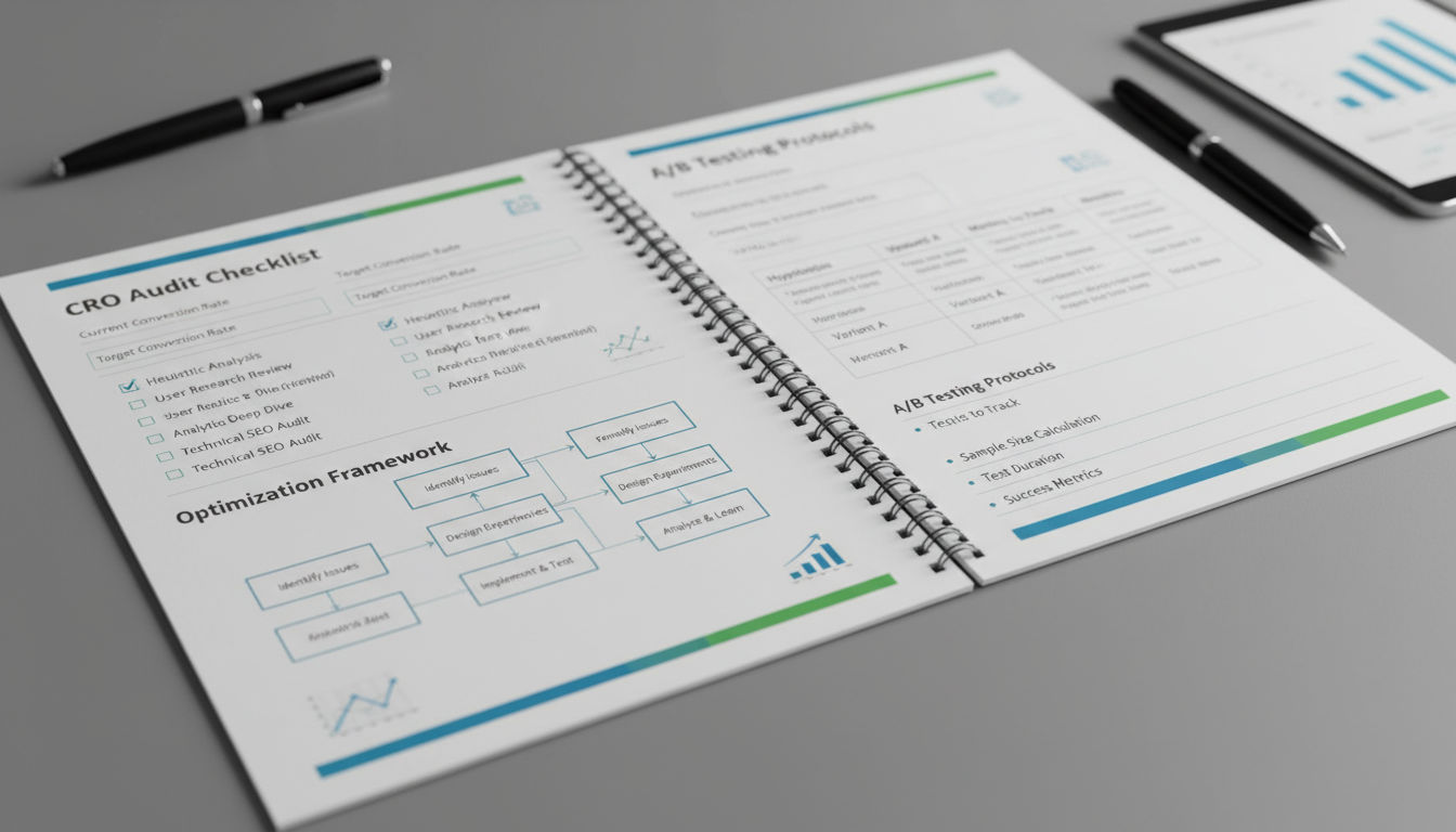
Documentation and Reporting Templates
Proper documentation turns individual tests into institutional knowledge. Your template should capture everything needed to understand and replicate results.
Test setup documentation includes screenshots of both variations, hypothesis, metrics being tracked, and test parameters. This provides context for future analysis.
Results reporting should include conversion rates for each variation, statistical significance, sample sizes, and test duration. Include both the winning variation and the lift achieved.
Insights and learnings capture why you think the test performed as it did. Did the results confirm your hypothesis? What did you learn about visitor behavior? What questions does this raise?
Implementation notes document what happened after the test. Was the winner implemented? Were there technical issues? Did the lift hold after full rollout?
Test archive organization makes past tests searchable. Tag tests by page type, element tested, and result. This prevents repeating failed experiments and helps identify patterns across tests.
At Vohr Tech, we've seen how systematic testing transforms website performance. Our clients in Montreal and beyond have achieved conversion increases of 50-200% by following structured optimization frameworks rather than making random changes.
Conclusion
Conversion rate optimization isn't a one-time project. It's an ongoing process of understanding your visitors, identifying barriers, testing solutions, and continuously improving. The templates and frameworks in this guide provide the structure to make that process systematic and repeatable.
Start with the pre-optimization audit to understand your current state. Use the page-specific templates to ensure comprehensive coverage of conversion elements. Implement the testing framework to validate changes with data rather than assumptions.
Next Steps for Implementation
Begin with your highest-traffic pages. These offer the biggest potential impact from optimization efforts. Use the audit checklist to identify the most obvious problems, then prioritize fixes based on the impact-difficulty matrix.
Set up proper analytics and behavior tracking if you haven't already. You can't optimize what you don't measure. Ensure you're capturing all relevant conversion data and user interactions.
Create a testing calendar for the next quarter. Don't try to test everything at once. Pick three to five high-priority tests and schedule them with adequate time for each to reach statistical significance.
Document everything using the templates provided. This creates a knowledge base that makes future optimization easier and prevents repeating mistakes.
Measuring Your CRO Success
Track your overall conversion rate trend over time. Month-over-month improvements demonstrate the cumulative impact of your optimization efforts. Don't expect overnight transformations; sustainable improvement comes from consistent testing and refinement.
Monitor conversion rates by traffic source and device type. This reveals whether improvements benefit all visitors or just specific segments. You might discover that mobile optimization deserves extra focus or that paid traffic converts differently than organic.
Calculate the revenue impact of conversion improvements. A 1% conversion increase might sound small, but multiply it by your traffic volume and average order value. The business impact becomes clear when you see actual dollar figures.
When to Revisit Your Templates
Review and update your templates quarterly. As you learn what works for your specific audience, customize the checklists to reflect those insights. Remove items that consistently prove irrelevant and add checks for issues you've discovered.
Revisit all major pages whenever you make significant site changes. New designs, updated products, or revised messaging require fresh optimization. Don't assume that previous optimization work still applies.
Test consistently even after achieving strong results. Visitor behavior changes, competitors evolve, and new best practices emerge. What worked last year might not work today. Ongoing testing keeps you ahead of these changes.
If you're ready to implement a systematic conversion optimization program but need expert guidance, reach out to our team. We help businesses throughout Montreal and beyond transform their websites into high-performing conversion machines. Check out our recent projects to see the results we've achieved for clients across industries.
Remember, every visitor represents an opportunity. With the right templates and systematic approach, you can turn more of those opportunities into conversions, customers, and revenue.