Introduction
Your website might be attracting thousands of visitors each month, but if they're not taking action, that traffic isn't helping your business grow. This is where conversion rate optimization techniques come into play.
Think of your website as a store. You wouldn't just focus on getting people through the door. You'd also want to make sure they actually buy something once they're inside. That's exactly what CRO does for your digital presence.
Every visitor who doesn't convert represents a missed opportunity. Maybe they couldn't find what they needed. Perhaps your call-to-action wasn't clear enough. Or your page took too long to load and they gave up.
The good news? Small improvements in your conversion rate can lead to massive growth. If you're currently converting at 2% and you increase that to 4%, you've just doubled your results without spending another dollar on advertising.
In this guide, you'll discover proven conversion rate optimization techniques that work for businesses of all sizes. We'll cover everything from fundamental testing strategies to advanced personalization tactics. You'll learn how to identify what's holding your conversions back and exactly what to do about it.
Whether you're running an e-commerce store in Montreal or offering services globally, these strategies will help you turn more visitors into customers. Let's start by understanding what conversion rate optimization really means.
What Is Conversion Rate Optimization?
Conversion rate optimization is the systematic process of increasing the percentage of website visitors who complete a desired action. That action could be making a purchase, filling out a form, signing up for a newsletter, or calling your business.
Here's a simple way to think about it. If 100 people visit your website and 3 of them become customers, your conversion rate is 3%. CRO techniques help you turn that 3% into 4%, 5%, or even higher.
The math is straightforward but powerful. Let's say your average customer is worth $1,000 to your business. With 10,000 monthly visitors at a 3% conversion rate, you're generating $300,000. Increase that to just 4%, and you're now at $400,000. That's an extra $100,000 without spending more on advertising.
Why CRO Matters for Your Bottom Line
Most businesses focus heavily on driving more traffic to their websites. They invest in SEO, pay-per-click ads, and social media marketing. While traffic is important, it's only half the equation.
Improving your conversion rate is often more cost-effective than buying more traffic. If you're paying $5 per click and converting at 2%, each customer costs you $250. Double your conversion rate to 4%, and that cost drops to $125.
CRO also provides insights into what your customers actually want. Through testing and analysis, you learn what messages resonate, which designs work best, and what obstacles prevent people from converting.
The Relationship Between Traffic and Conversions
Many business owners assume they need more visitors to grow. Sometimes that's true. But often, the real problem isn't traffic volume but conversion effectiveness.
Imagine you have a leaky bucket. You could pour more water in, or you could fix the leak. CRO fixes the leak.
Quality matters more than quantity. A thousand highly targeted visitors who convert at 5% will generate more revenue than ten thousand random visitors converting at 0.5%. Understanding this relationship helps you allocate your marketing budget more effectively.
The best approach combines both strategies. Drive qualified traffic to your website while continuously optimizing the experience to convert more of those visitors.
Essential CRO Techniques for Your Website
Testing and analyzing user behavior forms the foundation of effective conversion rate optimization. These fundamental techniques help you understand what's working and what needs improvement.
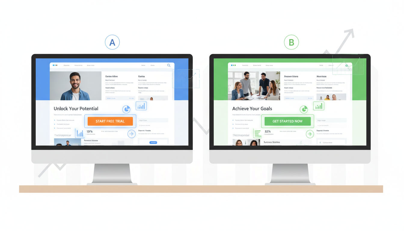
A/B Testing Fundamentals
A/B testing compares two versions of a webpage to see which performs better. You show version A to half your visitors and version B to the other half, then measure which converts more effectively.
Start with high-impact elements. Test your headlines, call-to-action buttons, images, and form fields first. These elements typically have the biggest influence on conversion rates.
Only test one element at a time when you're starting out. If you change both your headline and button color simultaneously, you won't know which change caused the improvement.
Run tests long enough to gather meaningful data. A common mistake is ending tests too early. You need at least 100 conversions per variation and typically 1-2 weeks of data to account for daily fluctuations.
Statistical significance matters. A tool showing "95% confidence" means there's only a 5% chance your results happened by accident. Don't make decisions based on insufficient data.
Multivariate Testing Strategies
Multivariate testing takes A/B testing further by testing multiple elements simultaneously. Instead of just testing headline A versus headline B, you test different combinations of headlines, images, and buttons together.
This approach works best for high-traffic websites. You need substantial visitor volume to test multiple variations effectively. Small businesses should typically stick with A/B testing.
Use multivariate testing when elements interact with each other. Sometimes a headline works great with one image but poorly with another. This testing method reveals those relationships.
The complexity increases quickly. Testing 3 headlines, 3 images, and 2 button colors creates 18 possible combinations. Make sure you have enough traffic to support this.
Heat Mapping and User Behavior Analysis
Heat maps show where visitors click, scroll, and move their mouse on your pages. These visual representations reveal what captures attention and what gets ignored.
Click maps show exactly where people click, including non-clickable elements. If visitors repeatedly click something that isn't a link, that's valuable information about their expectations.
Scroll maps reveal how far down the page people actually read. You might discover that your most important content sits below where most visitors stop scrolling.
Movement maps track mouse movement, which often correlates with eye movement. These maps help you understand the path visitors take through your content.
Use heat maps to identify confusion points. If people are clicking all over the page randomly, they're probably looking for something they can't find.
Session Recording Insights
Session recordings capture real visitor interactions with your website. Watching these recordings feels like looking over someone's shoulder as they navigate your site.
You'll see exactly where people struggle. Maybe they fill out a form three times before giving up. Perhaps they keep clicking the back button. These insights are gold for optimization.
Look for patterns across multiple recordings. One person struggling might be an outlier, but ten people making the same mistake indicates a real problem.
Pay special attention to visitors who almost convert but don't. Watch recordings of people who add items to their cart but abandon checkout. Their behavior reveals friction points in your process.
Session recordings complement quantitative data. Analytics tell you what's happening, but recordings show you why. Together, they create a complete picture of your conversion challenges.
Website Optimization Through Strategic Design

Design isn't just about aesthetics. Every visual element either helps or hinders conversions. Strategic design removes friction and guides visitors toward taking action.
Simplifying Navigation for Better Conversions
Complex navigation overwhelms visitors. When people face too many choices, they often choose nothing at all. This phenomenon, called decision paralysis, kills conversions.
Limit your main navigation to 5-7 items maximum. Each additional menu item reduces the likelihood that visitors will find what they need quickly.
Quick question
Want to turn this into a real plan?
If you want expert help with strategy, design, development, marketing, or automation — we’ll recommend the fastest path forward for your goals.
Use clear, descriptive labels instead of creative terminology. "Services" works better than "Solutions." "Contact Us" beats "Let's Talk." Visitors shouldn't have to guess what clicking a link will do.
Implement a logical hierarchy. Your most important pages should be easiest to find. If contact information requires three clicks to reach, you're making it too hard for people to do business with you.
Consider sticky navigation that stays visible as users scroll. This keeps your call-to-action accessible without forcing visitors to scroll back up.
Mobile-Responsive Design Best Practices
Over 60% of web traffic now comes from mobile devices. If your site doesn't work perfectly on phones and tablets, you're losing more than half your potential conversions.
Touch targets need to be large enough for fingers, not mouse cursors. Buttons should be at least 44x44 pixels. Smaller targets lead to misclicks and frustration.
Text must be readable without zooming. Use at least 16px font size for body text. Visitors shouldn't have to pinch and zoom to read your content.
Forms become especially challenging on mobile. Minimize required fields and use appropriate input types. The keyboard should automatically switch to numbers for phone fields and email layouts for email addresses.
Test your site on actual devices, not just desktop browser simulators. Real-world testing reveals issues that simulators miss, like how your site performs on slower connections.
Page Load Speed Optimization
Speed directly impacts conversions. Research shows that a one-second delay in page load time can reduce conversions by 7%. Every millisecond matters.
Compress images without sacrificing quality. Large image files are the most common culprit behind slow load times. Tools can reduce file sizes by 70% or more with minimal visual impact.
Minimize HTTP requests by combining files where possible. Each separate CSS file, JavaScript file, and image requires a separate request, slowing down your page.
Enable browser caching so returning visitors don't have to download everything again. This dramatically improves load times for repeat visitors.
Consider a content delivery network (CDN) if you serve visitors globally. CDNs store copies of your site on servers around the world, reducing the physical distance data must travel.
Visual Hierarchy and User Flow
Visual hierarchy guides visitors' eyes through your content in a specific order. Proper hierarchy ensures people see your most important elements first.
Size matters most. Larger elements naturally draw more attention. Your headline should be bigger than subheadings, which should be bigger than body text.
Contrast creates focus. A brightly colored button on a neutral background immediately catches the eye. Use contrast strategically to highlight conversion elements.
White space isn't wasted space. It gives content room to breathe and makes pages easier to scan. Cramming too much information together overwhelms visitors.
Create a clear visual path from headline to benefit to call-to-action. Your design should naturally lead visitors through your conversion funnel without confusion.
Conversion Tactics for Landing Pages
Landing pages serve one purpose: converting visitors into leads or customers. Every element on a landing page should support that goal. Remove anything that doesn't.
Crafting Compelling Headlines
Your headline determines whether visitors stay or leave. Most people decide within 3-5 seconds if your page is worth their time. That decision happens at the headline.
Lead with the primary benefit, not features. "Increase Your Sales by 40%" works better than "Advanced CRM Software." People care about outcomes, not specifications.
Be specific when possible. "Save 2 Hours Every Day" beats "Save Time." Concrete numbers feel more credible and create clearer mental images.
Match your headline to the source that brought visitors to your page. If someone clicked an ad about "affordable web design," your headline should address affordable web design, not general digital marketing.
Test different headline approaches. Try questions, statements, and how-to formats. Small changes in wording can produce surprisingly different results.
Strategic Call-to-Action Placement
Your call-to-action button is where conversion happens. Its placement, design, and wording all impact whether visitors click.
Place your primary CTA above the fold so visitors see it without scrolling. People who are ready to convert shouldn't have to hunt for the button.
Use contrasting colors that stand out from your overall design. The button should be the most visually prominent element on the page.
Make buttons large enough to notice but not so large they look awkward. A good rule of thumb is making them at least as wide as your main content column.
Repeat your CTA on longer pages. Someone who reads your entire page shouldn't have to scroll back up to convert. Place CTAs after major benefit sections.
Use action-oriented, specific button text. "Start Your Free Trial" outperforms "Submit." "Get My Custom Quote" beats "Click Here." Tell people exactly what happens when they click.
Form Optimization Techniques
Every form field you add reduces conversion rates. Each additional question makes people more likely to abandon the process. Only ask for information you absolutely need.
Start with the minimum viable form. You can always collect more information later. Getting someone into your funnel matters more than having complete data upfront.
Use inline validation that shows errors as people type. Waiting until someone submits the form to show errors creates frustration. Real-time feedback improves completion rates.
Clearly mark which fields are required. People get annoyed when they submit a form only to discover they missed a required field that wasn't marked.
Provide helpful placeholder text and labels. "john@example.com" shows the expected format better than just "Email." Clear examples reduce confusion and errors.
Consider multi-step forms for longer processes. Breaking a 15-field form into three steps of five fields each feels less overwhelming. Progress indicators help people see they're making progress.
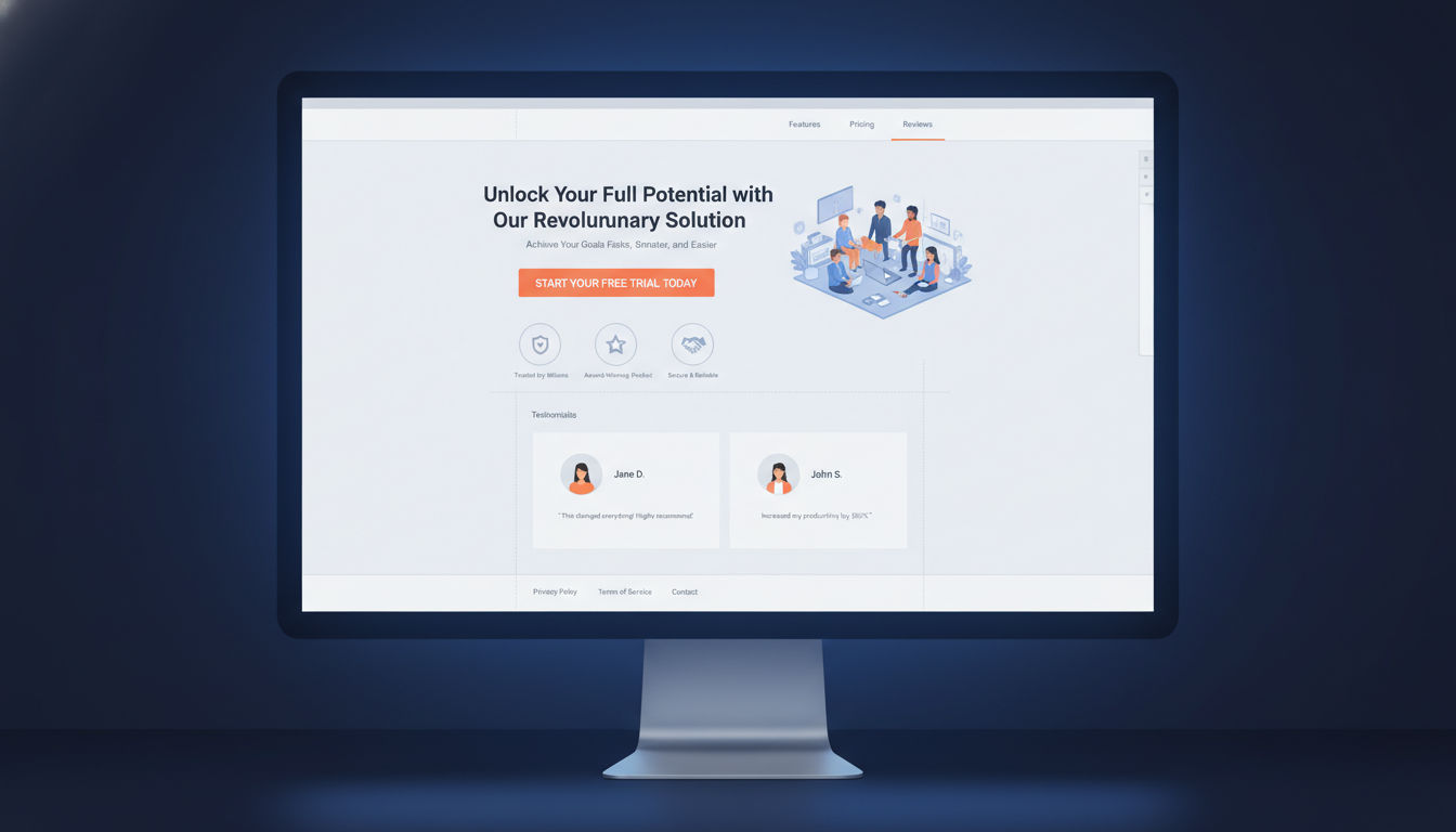
Trust Signals and Social Proof
Visitors need to trust you before they'll convert. Trust signals reduce perceived risk and increase confidence in your business.
Display customer testimonials prominently. Real quotes from real people prove that others have succeeded with your product or service. Include names and photos when possible for added credibility.
Show logos of recognizable clients or partners. Association with known brands transfers trust to your business. This works especially well for B2B companies.
Include security badges near forms and checkout buttons. SSL certificates, payment processor logos, and privacy certifications all reduce anxiety about sharing personal information.
Display specific numbers when possible. "Over 5,000 satisfied customers" feels more credible than "thousands of customers." Specificity suggests honesty.
Add guarantees to reduce purchase risk. Money-back guarantees, free trials, and no-commitment offers lower the barrier to conversion. Make these guarantees visible and easy to understand.
Persuasive Copywriting CRO Techniques

Words convert visitors into customers. The right message presented the right way can dramatically increase your conversion rate. Every word on your page should earn its place.
Writing Benefit-Driven Content
Features describe what your product does. Benefits describe what your product does for the customer. Benefits always win in conversion copywriting.
Transform features into benefits by asking "so what?" Your software has automated reporting. So what? That means customers save five hours per week on manual data entry.
Focus on outcomes, not processes. Customers don't buy web development services because they want code. They buy results like increased sales, better brand perception, or improved customer experience.
Use "you" and "your" more than "we" and "our." Customer-focused copy converts better than company-focused copy. Make the visitor the hero of the story.
Paint a picture of life after conversion. Help visitors imagine how much better things will be once they take action. This emotional connection drives decisions more than logical arguments.
Addressing Customer Pain Points
People are motivated more by avoiding pain than gaining pleasure. Effective copy acknowledges problems before presenting solutions.
Start by identifying your audience's biggest frustrations. What keeps them up at night? What problems are they actively trying to solve? Your copy should speak directly to these concerns.
Show empathy before offering solutions. Let visitors know you understand their struggles. "We know how frustrating it is when..." creates connection and trust.
Present your product or service as the solution to their specific problem. Don't just list what you offer. Explain how what you offer eliminates their pain point.
Use the PAS formula: Problem, Agitation, Solution. Identify the problem, make it feel urgent by agitating it, then present your solution as the answer.
Creating Urgency Without Pressure
Urgency encourages action, but artificial or manipulative urgency damages trust. The key is creating genuine reasons to act now.
Limited-time offers work when they're real. If you're running a legitimate promotion that ends on a specific date, say so. Just make sure the deadline is real.
Scarcity can be powerful if it's honest. "Only 3 spots left this month" works for service businesses with actual capacity limits. Fake scarcity backfires when discovered.
Highlight opportunity cost. Help visitors understand what they're missing by waiting. "Every day without optimization is leaving money on the table" creates urgency without pressure.
Use seasonal or situational urgency. "Get your website ready for the holiday shopping season" provides a natural deadline without manufactured scarcity.
Avoid aggressive countdown timers or constantly resetting deadlines. These tactics may work short-term but damage long-term credibility and brand reputation.
Power Words That Convert
Certain words trigger emotional responses that influence decision-making. Strategic use of these power words can boost conversion rates.
Words like "you," "free," "because," "instantly," and "new" have proven track records. They capture attention and create positive associations.
Use sensory words that help people imagine experiences. "Smooth," "crisp," "effortless," and "vibrant" create mental images that pure description can't match.
Action verbs create momentum. "Discover," "unlock," "transform," and "accelerate" feel more dynamic than passive alternatives like "learn about" or "see."
Numbers add specificity and credibility. "Increase conversions by 47%" feels more believable than "dramatically increase conversions." Specific numbers suggest real data.
Balance power words with natural, conversational language. Overusing them makes copy feel manipulative. The goal is persuasion, not manipulation.
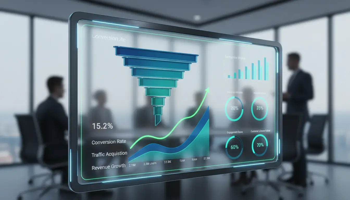
Leveraging Data and Analytics
![]()
Gut feelings don't optimize conversion rates. Data does. Systematic analysis reveals what's working, what's failing, and where your biggest opportunities lie.
Setting Up Conversion Tracking
You can't improve what you don't measure. Proper conversion tracking forms the foundation of any CRO strategy.
Define your conversion goals clearly. A conversion might be a purchase, form submission, phone call, or email signup. Identify what actions matter most to your business.
Implement tracking for all conversion types. Use Google Analytics goals, Facebook Pixel, or other tracking tools appropriate for your platform. Make sure every important action gets tracked.
Set up event tracking for micro-conversions too. Not everyone converts on their first visit. Track actions like video views, PDF downloads, or time on page that indicate interest.
Create separate tracking for different traffic sources. Conversions from organic search might behave differently than paid ads or social media. Understanding these differences helps you optimize each channel.
Test your tracking regularly. Broken tracking is worse than no tracking because it gives you false confidence in bad data. Verify that your tracking fires correctly at least monthly.
Identifying Conversion Bottlenecks
Your conversion funnel has weak points where visitors drop off. Finding and fixing these bottlenecks produces the biggest improvements.
Map out your complete conversion path. From first landing to final conversion, list every step visitors must take. Each step is a potential drop-off point.
Use funnel visualization tools to see where people abandon the process. Google Analytics offers funnel reports that show exactly where you're losing people.
Calculate drop-off rates between each step. If 100 people start your checkout process but only 30 complete it, you have a 70% abandonment rate. That's your biggest opportunity.
Look for unusual patterns. If everyone abandons at the same step, that step has a serious problem. If abandonment is spread evenly, your entire process needs improvement.
Prioritize bottlenecks by potential impact. Fixing a step where you lose 50% of visitors matters more than fixing a step where you lose 5%.
Using Google Analytics for CRO Insights
Google Analytics provides free, powerful insights for conversion optimization. Most businesses barely scratch the surface of what's possible.
Study your behavior flow reports. These show the paths visitors take through your site. You'll discover unexpected navigation patterns and dead ends.
Analyze landing page performance. Which pages convert best? Which ones attract traffic but fail to convert? Double down on winners and fix or eliminate losers.
Segment your audience for deeper insights. Compare mobile versus desktop, new versus returning visitors, or different traffic sources. Each segment might need different optimization approaches.
Review site search data if you have an internal search function. What are people searching for? If many visitors search for the same thing, make it easier to find.
Set up custom dashboards focused on conversion metrics. Instead of swimming through all available data, create views that show only what matters for optimization.
Key Metrics to Monitor
Tracking everything creates noise. Focus on metrics that directly relate to conversion performance and business outcomes.
Conversion rate remains the primary metric. Track it overall and for specific segments, pages, and campaigns. This is your north star.
Average order value matters for e-commerce. Sometimes increasing how much each customer spends matters more than increasing customer count.
Bounce rate indicates whether visitors find what they expected. High bounce rates suggest a mismatch between your content and visitor expectations.
Time on page helps gauge engagement. Longer time on important pages usually indicates interest, though extremely long times might indicate confusion.
Exit rate shows where visitors leave your site. High exit rates on key conversion pages indicate problems that need addressing.
Pages per session reveals engagement depth. Visitors who view multiple pages are typically more interested than those who view one and leave.
Advanced Conversion Tactics
Once you've mastered the fundamentals, these advanced techniques can push your conversion rates even higher. They require more sophistication but deliver impressive results.
Personalization Strategies
Generic experiences convert poorly in a world where people expect relevance. Personalization tailors content to individual visitors based on their characteristics or behavior.
Start with simple geographic personalization. Showing visitors content relevant to their location increases relevance. Montreal businesses can emphasize local service, while still serving broader audiences.
Personalize based on traffic source. Someone coming from a paid ad about a specific service should see content focused on that service, not a generic homepage.
Use behavioral triggers to personalize returning visitor experiences. If someone viewed your pricing page three times, show them a special offer or case study on their next visit.
Next step
Ready for a quote and timeline?
Send a quick note with what you’re building, your deadline, and what success looks like — we’ll reply with clear next steps.
Segment by company size or industry for B2B businesses. Enterprise clients need different messaging than small businesses. Show each segment content that addresses their specific concerns.
Implement dynamic content that changes based on user data. Your website platform or marketing automation tools can swap headlines, images, or offers based on visitor characteristics.
Exit-Intent Popups
Exit-intent technology detects when visitors are about to leave and displays a final conversion opportunity. Used correctly, these popups recover conversions that would otherwise be lost.
Trigger popups only on exit intent, not on entry or time delays. Interrupting visitors immediately damages user experience. Let them browse first.
Offer genuine value in your popup. A compelling discount, free resource, or exclusive content gives visitors a reason to reconsider leaving.
Keep popup design clean and message clear. Visitors are already leaving, so you have seconds to change their mind. Complexity kills conversions here.
Make popups easy to close. Forcing people to hunt for the close button creates frustration. A clear, obvious close option actually increases popup effectiveness by reducing annoyance.
Test different offers and messaging. Your audience might respond better to educational content than discounts, or vice versa. Data reveals what works for your specific visitors.
Retargeting Techniques
Most visitors don't convert on their first visit. Retargeting brings them back by showing ads after they leave your site.
Install retargeting pixels from platforms like Facebook and Google. These track visitors so you can show them ads later as they browse other sites.
Segment your retargeting audiences by behavior. Someone who viewed your services page needs different messaging than someone who abandoned a form halfway through.
Create sequential retargeting campaigns that tell a story. First ad builds awareness, second ad addresses objections, third ad offers an incentive. This progression moves people toward conversion.
Set frequency caps to avoid annoying people with too many ads. Seeing your ad 2-3 times might be helpful, but seeing it 20 times feels like stalking.
Use dynamic retargeting for e-commerce to show people the exact products they viewed. This highly relevant approach significantly outperforms generic retargeting ads.
Cart Abandonment Solutions
Average cart abandonment rates exceed 70%. Recovering even a small percentage of abandoned carts can substantially increase revenue.
Send abandoned cart emails within 1-2 hours of abandonment. The sooner you remind people, the more likely they are to return. Interest fades quickly.
Include product images and details in recovery emails. Help people remember exactly what they were buying. Make it easy to return to their cart with one click.
Address common abandonment reasons in your messaging. High shipping costs, security concerns, or comparison shopping all cause abandonment. Your recovery email can address these issues.
Consider offering a small incentive for high-value abandoned carts. A 10% discount might be worth it to recover a $500 order, but test whether incentives actually improve recovery rates.
Create a multi-email sequence rather than a single reminder. First email reminds, second email addresses objections, third email might include an incentive. This sequence converts better than single emails.
Common CRO Mistakes to Avoid
Even experienced marketers make mistakes that undermine their optimization efforts. Avoiding these common pitfalls saves time and improves results.
Testing Without Sufficient Data
The most common CRO mistake is ending tests too early. Small sample sizes lead to false conclusions and bad decisions.
You need at least 100 conversions per variation before drawing conclusions. With fewer conversions, random variation can make bad changes look good or good changes look bad.
Run tests for complete business cycles. If your conversion rates vary by day of week, testing only Monday through Wednesday gives incomplete data. Test for at least one full week, preferably two.
Understand statistical significance before making changes. A 95% confidence level means there's still a 5% chance your results happened randomly. Lower confidence levels are essentially guessing.
Avoid "peeking" at results and ending tests early when you see a winner. This practice, called p-hacking, dramatically increases false positives. Decide on your sample size beforehand and stick to it.
Ignoring Mobile Users
Mobile traffic dominates most websites, yet many businesses still optimize primarily for desktop. This oversight costs conversions.
Test every change on actual mobile devices. What looks great on your desktop monitor might be unusable on a phone. Responsive design doesn't guarantee good mobile experience.
Consider mobile-first design rather than desktop-first. Design for the smallest screen first, then enhance for larger screens. This approach ensures mobile users get a great experience.
Simplify mobile forms even more than desktop forms. Typing on phones is harder, so every field you remove has bigger impact on mobile than desktop.
Check mobile page speed separately from desktop. Mobile connections are often slower, and mobile devices have less processing power. Your desktop speed doesn't predict mobile speed.
Overcomplicating the Conversion Process
More steps, more fields, and more choices all reduce conversion rates. Simplicity wins.
Remove unnecessary form fields. Every field you eliminate increases completion rates. Ask yourself if you really need each piece of information before someone converts.
Reduce the number of steps in your checkout or signup process. Amazon's one-click ordering exists because fewer steps mean higher conversion. How can you simplify your process?
Limit choices on landing pages. Too many options create decision paralysis. Give visitors one clear path to conversion rather than multiple competing options.
Eliminate distractions on conversion pages. Navigation, sidebar widgets, and links to other pages all give visitors reasons to leave. Conversion pages should focus entirely on converting.
Don't ask for information you can collect later. You can always gather additional details after someone becomes a customer. Getting them into your funnel matters most.
Conclusion
Conversion rate optimization isn't a one-time project. It's an ongoing process of testing, learning, and improving. The techniques covered in this guide provide a solid foundation for increasing your conversion rates and growing your business.
Start with the fundamentals. Implement proper tracking, run A/B tests on high-impact elements, and fix obvious problems like slow load speeds or confusing navigation. These basics often deliver the biggest improvements.
Remember that every business is unique. What works for one website might not work for yours. That's why testing matters more than following best practices blindly. Let data guide your decisions.
Small improvements compound over time. A 10% increase in conversion rate might not sound dramatic, but it means 10% more customers, revenue, and growth without spending more on advertising.
If you need help implementing these conversion rate optimization techniques, our team at Vohrtech specializes in web development and digital marketing services that drive measurable results. We've helped businesses across Montreal and beyond transform their websites into conversion machines.
Ready to start optimizing? Review your analytics, identify your biggest bottleneck, and run your first test. Or contact us to discuss how we can help accelerate your conversion rate optimization efforts. Check out our portfolio of successful projects to see what's possible when you prioritize conversion optimization.
The difference between a good website and a great one isn't just design or traffic. It's conversion rate. Start optimizing today.